How to add a vertical line to the scatter chart
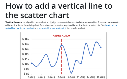
Vertical lines are usually added to the chart to highlight the current date, a critical date, or a deadline. There are many ways to add a vertical line to the existing chart. Errors bars are the easiest way to add a vertical line to a scatter plot. See how to add a vertical line to a line or bar chart or a horizontal line to a scatter plot, line, or column chart:
How to add a horizontal line to the chart
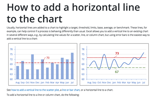
Usually, horizontal lines are added to a chart to highlight a target, threshold, limits, base, average, or benchmark. These lines, for example, can help control if a process is behaving differently than usual. Excel allows you to add a vertical line to an existing chart in several different ways, e.g., by calculating line values for a scatter, line, or column chart, but using error bars is the easiest way to add a vertical line to a chart:
Cascade chart using stepped line chart in Excel
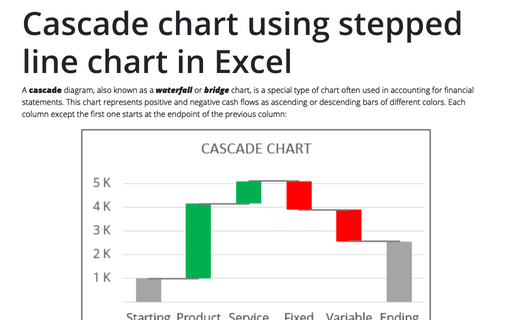
A cascade diagram, also known as a waterfall or bridge chart, is a special type of chart often used in accounting for financial statements. This chart represents positive and negative cash flows as ascending or descending bars of different colors. Each column except the first one starts at the endpoint of the previous column:
Highlight data series in line chart
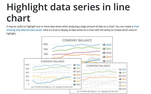
It may be useful to highlight one or more data series when analyzing a large amount of data on a chart. You can create a chart showing only selected data series. Here is a trick to display all data series on a chart with the ability to choose which ones to highlight:
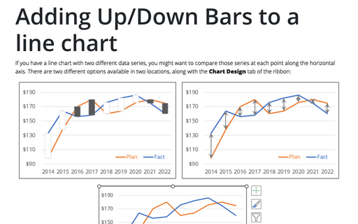
Adding Up/Down Bars to a line chart
If you have a line chart with two different data series, you might want to compare those series at each point along the horizontal axis. There are two different options available in two locations, along with the Chart Design tab of the ribbon:
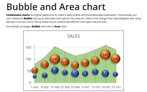
Bubble and Area chart
Combination charts are a great opportunity to create a really creative and memorable data presentation. Unfortunately, you can't choose the Bubble chart as an alternative chart type for line, area, etc. charts in the Change Chart Type dialog box (see Using two axes in the one chart). This tip shows how to combine two different chart types into one chart.
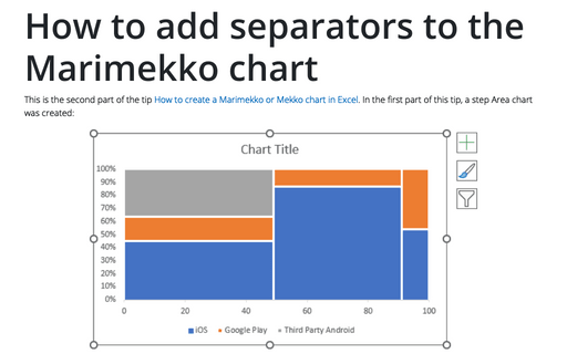
How to add separators to the Marimekko chart
This is the second part of the tip How to create a Marimekko or Mekko chart in Excel. In the first part of this tip, a step Area chart was created:
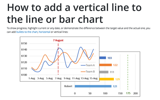
How to add a vertical line to the line or bar chart
To show progress, highlight current or any date, or demonstrate the difference between the target value and the actual one, you can add bullets to the chart, horizontal or vertical lines:
Glossy Gantt chart with a vertical line
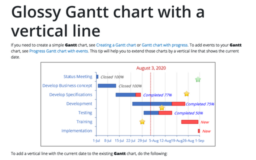
If you need to create a simple Gantt chart, see Creating a Gantt chart or Gantt chart with progress. To add events to your Gantt chart, see Progress Gantt chart with events. This tip will help you to extend those charts by a vertical line that shows the current date.
How to create Waterfall chart
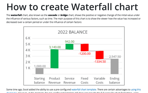
The waterfall chart, also known as the cascade or bridge chart, shows the positive or negative change of the initial value under the influence of various factors, such as time. The main purpose of this chart is to show the viewer how the value has increased or decreased over a certain period or under the influence of certain factors:
