Creating a Candlestick Stock chart
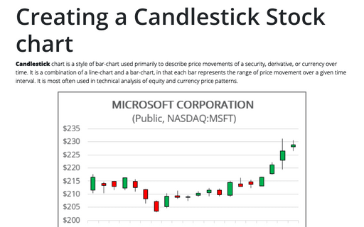
Candlestick chart is a style of bar-chart used primarily to describe price movements of a security, derivative, or currency over time. It is a combination of a line-chart and a bar-chart, in that each bar represents the range of price movement over a given time interval. It is most often used in technical analysis of equity and currency price patterns.
Unrealized Gain and Loss
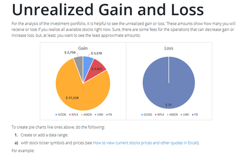
For the analysis of the investment portfolio, it is helpful to see the unrealized gain or loss. These amounts show how many you will receive or lose if you realize all available stocks right now. Sure, there are some fees for the operations that can decrease gain or increase loss, but, at least, you want to see the least approximate amounts:
Creating a Candlestick Stock chart with volume
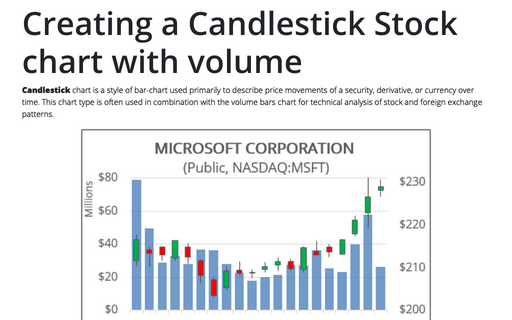
Candlestick chart is a style of bar-chart used primarily to describe price movements of a security, derivative, or currency over time. This chart type is often used in combination with the volume bars chart for technical analysis of stock and foreign exchange patterns.
The Area chart for Investments
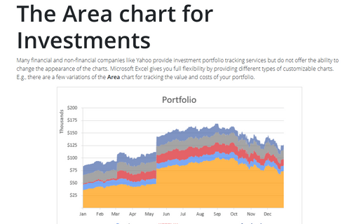
Many financial and non-financial companies like Yahoo provide investment portfolio tracking services
but do not offer the ability to change the appearance of the charts. Microsoft Excel gives you full
flexibility by providing different types of customizable charts. E.g., there are a few variations of
the Area chart for tracking the value and costs of your portfolio.
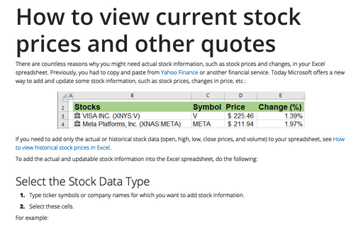
How to view current stock prices and other quotes in Excel
There are countless reasons why you might need actual stock information, such as stock prices and changes, in your Excel spreadsheet. Previously, you had to copy and paste from Yahoo Finance or another financial service.
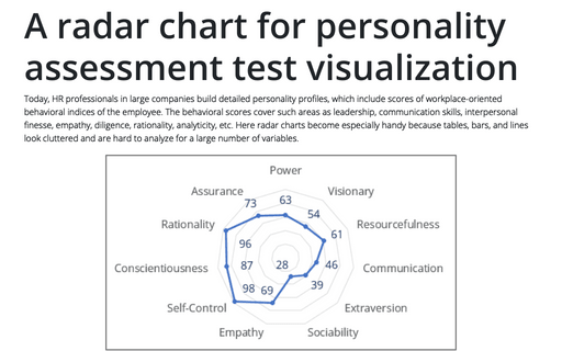
A radar chart for personality assessment test visualization
Today, HR professionals in large companies build detailed personality profiles, which include scores of workplace-oriented behavioral indices of the employee. The behavioral scores cover such areas as leadership, communication skills, interpersonal finesse, empathy, diligence, rationality, analyticity, etc.
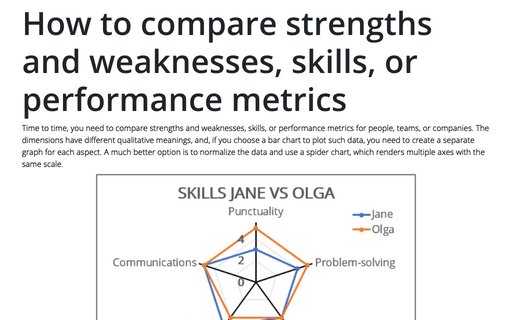
How to compare strengths and weaknesses, skills, or performance metrics
Time to time, you need to compare strengths and weaknesses, skills, or performance metrics for people, teams, or companies. The dimensions have different qualitative meanings, and, if you choose a bar chart to plot such data, you need to create a separate graph for each aspect.
How to create irregular polygon charts in Excel
Many organizations utilize 360-degree feedback (also known as multi-rater feedback, multi-source feedback, multi-source assessment, or 360-degree review) to assist
employees in work and social skills development. This process includes gathering employee's subordinates, colleagues, supervisor(s), and manager(s) feedback; and comparing self-evaluation and individual group metrics.
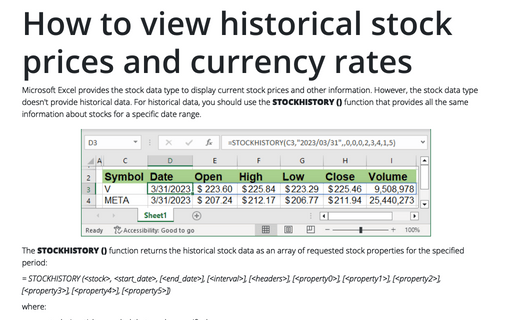
How to view historical stock prices and currency rates in Excel
Microsoft Excel provides the stock data type to display current stock prices and other information. However, the stock data type doesn't provide historical data. For historical data, you should use the STOCKHISTORY () function that provides all the same information about stocks for a specific date range.
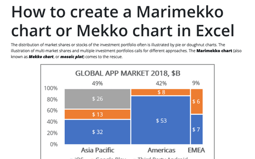
How to create a Marimekko chart or Mekko chart in Excel
The distribution of market shares or stocks of the investment portfolio often is illustrated
by pie or doughnut charts. The illustration of multi-market shares and multiple investment
portfolios calls for different approaches. The Marimekko chart (also known as
Mekko chart, or mosaic plot) comes to the rescue.
