Excel 365
Cascade chart using stepped line chart in Excel
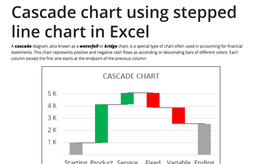
A cascade diagram, also known as a waterfall or bridge chart, is a special type of chart often used in accounting for financial statements. This chart represents positive and negative cash flows as ascending or descending bars of different colors. Each column except the first one starts at the endpoint of the previous column:
How to create step chart in Excel
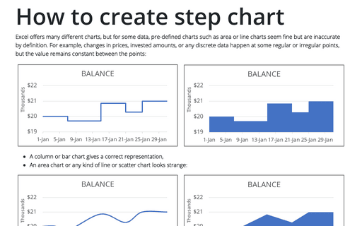
Excel offers many different charts, but for some data, pre-defined charts such as area or line charts seem fine but are inaccurate by definition. For example, changes in prices, invested amounts, or any discrete data happen at some regular or irregular points, but the value remains constant between the points:
How to show Likert scale chart with extra neutral
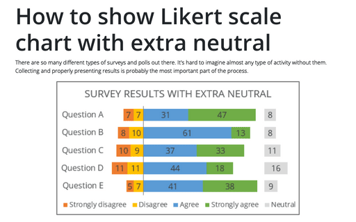
There are so many different types of surveys and polls out there. It's hard to imagine almost any type of activity without them. Collecting and properly presenting results is probably the most important part of the process.
How to show Likert scale chart (integrated neutral)
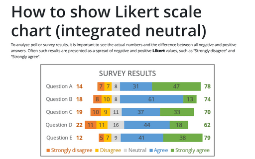
To analyze poll or survey results, it is important to see the actual numbers and the difference between all negative and positive answers. Often such results are presented as a spread of negative and positive Likert values, such as "Strongly disagree" and "Strongly agree".
How to use Camera tool in Excel
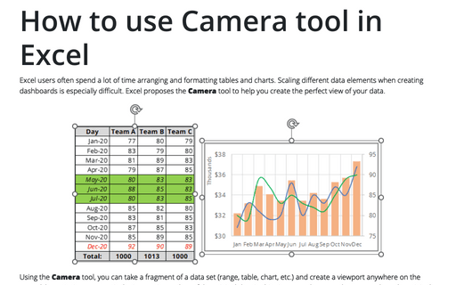
Excel users often spend a lot of time arranging and formatting tables and charts. Scaling different data elements when creating dashboards is especially difficult. Excel proposes the Camera tool to help you create the perfect view of your data.
How to create interactive chart with dropdown list in Excel
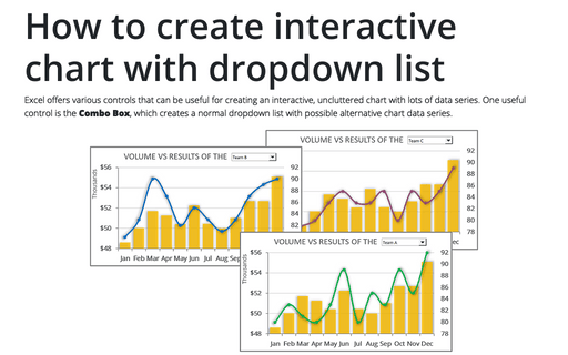
Excel offers various controls that can be useful for creating an interactive, uncluttered chart with lots of data series. One useful control is the Combo Box, which creates a normal dropdown list with possible alternative chart data series.
How to create interactive chart with checkboxes in Excel
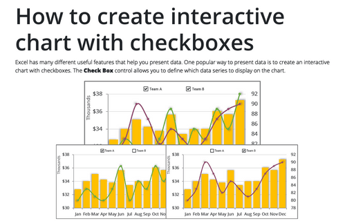
Excel has many different useful features that help you present data. One popular way to present data is to create an interactive chart with checkboxes. The Check Box control allows you to define which data series to display on the chart.
How to create interactive chart with radio or option buttons
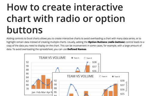
Adding controls to Excel charts allows you to create interactive charts to avoid overloading a chart with many data series, or to highlight certain data instead of creating multiple charts. Usually, adding the Option Buttons (radio buttons) control leads to a copy of the data you need to display on the chart. This can be inconvenient in some cases, for example, with a large amount of data. To avoid overloading the spreadsheet, you can use Defined Names.
How to create simple interactive chart with radio or option buttons
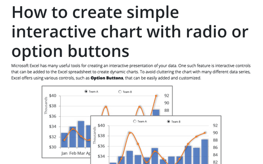
Microsoft Excel has many useful tools for creating an interactive presentation of your data. One such feature is interactive controls that can be added to the Excel spreadsheet to create dynamic charts. To avoid cluttering the chart with many different data series, Excel offers using various controls, such as Option Buttons, that can be easily added and customized.
Creating a simple competition chart
Competition is an integral part of the development of any company and community. From childhood, we compete for our favorite toys among peers, for leadership in games, and so on. Healthy competition helps to achieve many goals: from quickly solving problems to choosing the most appropriate strategy.
