Excel 365
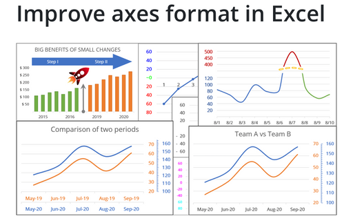
Improve axes format in Excel
Very few Excel users pay attention to the chart axes, but there are some tricks with axes that will help you to improve your visualizations with little or no efforts.
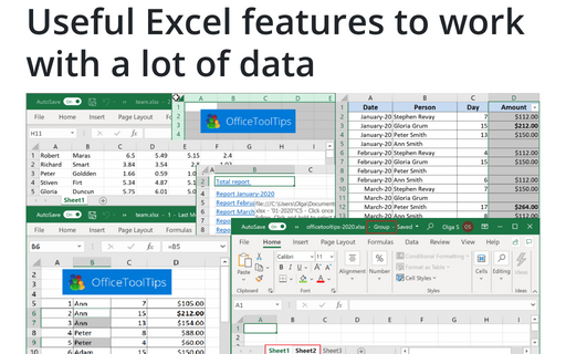
Useful Excel features to work with a lot of data
If you have a lot of data, manual editing and formatting of cells isn't an option anymore. However, Excel
provides many group operations that make those manipulations quick and easy.
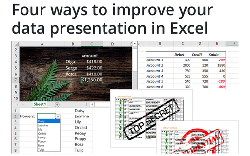
Four ways to improve your data presentation in Excel
Using simple tricks, you can convert your Excel spreadsheet from a table with rows and columns to an
interactive application that will help you represent the data more appealingly and conveniently.
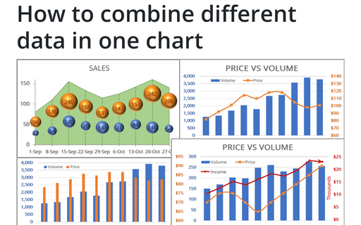
How to combine different data in one chart
To make your data more information, you can combine different chars in many ways.
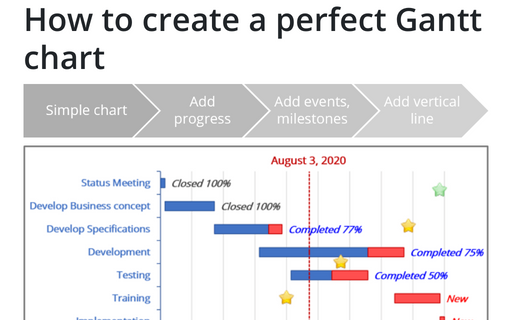
How to create a perfect Gantt chart
Gantt charts illustrate project schedules and, thus, often used by project managers. Project management tools like Microsoft Project are better suited for Gantt charts, but it is easy to create a Gantt chart in Excel following the simple steps.
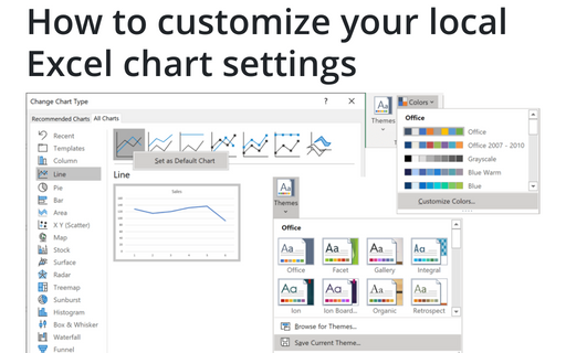
How to customize your local Excel chart settings
The default installation of Excel has reasonable presets for chart types and colors, but you can change those
defaults according to your own preferences.
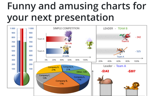
Funny and amusing charts for your next presentation
Several different Excel features can make your presentation less boring:
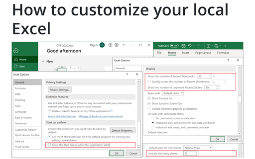
How to customize your local Excel
Excel is heavily used by all Microsoft Office users, and automatically opened workbooks, customizations of the menu, recent documents, and start screen allow you to save a lot of time.
5 Excel features to create data-dependent visualizations
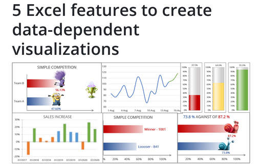
There are several useful features in Excel that can help to create your charts, which automatically change visual appearance depending on data.
The best way to organize your workbook using hyperlinks
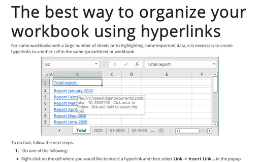
For some workbooks with a large number of sheets or highlighting some important data, it is necessary to create hyperlinks to another cell in the same spreadsheet or workbook.
