5 Excel features to create data-dependent visualizations
1. Label changes
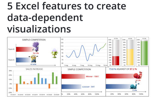
The simplest way to add interactivity to your charts is to use some cell value instead of a static text for the label. Also, you can make the chart more appealing by adding fancy images:
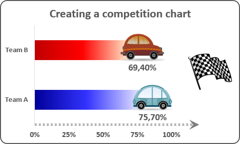
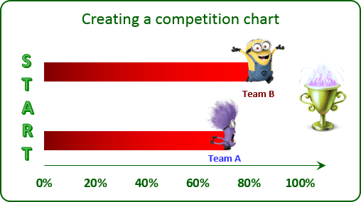
See Creating a simple competition chart in Excel 2016 and Creating a simple competition chart in Excel 2013 for more details.
2. Automatic data range updates
If you are adding data frequently, and, thus, each time need to adjust your data ranges so that your charts plot an updated data range, you may be interested in the trick that forces Excel to update the chart's data range whenever you add a new data to your worksheet:
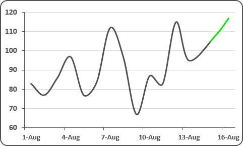
See Creating automatically extended plot ranges for more details.
3. Title depending on volume
For some presentations will be interesting to add a title that contains automatically updated data, for example, a text dependent on volume:
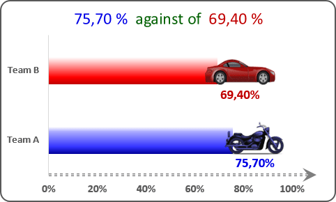
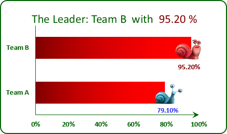
See How to create dependent on a volume chart title in Excel 2016 and How to create dependent on a volume chart title in Excel 2013 for more details.
4. Dynamically updated label text
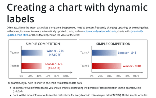
For some presentation of the competition will be more informative to see dynamically updated chart labels that depend on the value of other cells:
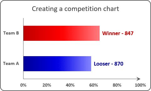
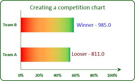
See Creating a chart with dynamic labels in Excel 2016 and Creating a chart with dynamic labels in Excel 2013 for more details.
5. Chart visual appearance depending on:
a. Volume:
Data visualization is a key cognitive tool that enables you to attract attention to your statements. E.g., you can direct your organization attention to insufficiently developed goals and praise them for successfully performed goals:
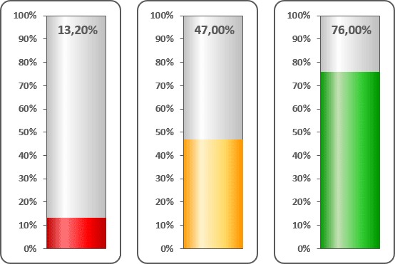
See Creating a semaphore thermometer chart for more details.
b. Data:
To emphasize differences between data in the chart, it will be interesting to create a column chart in which the color of each column depends on the value displayed:
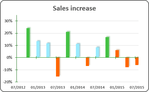
See Displaying conditional colors in a column chart for more details.
See also this tip in French: 5 fonctionnalités Excel pour créer des visualisations dépendantes des données.
