Chart in Excel 2016
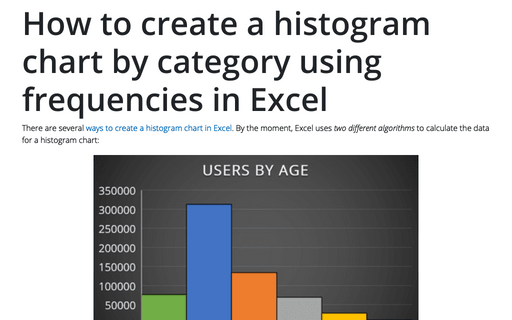
How to create a histogram chart by category using frequencies in Excel
There are several
ways to create a histogram chart in Excel.
By the moment, Excel uses two different algorithms to calculate the data
for a histogram chart:
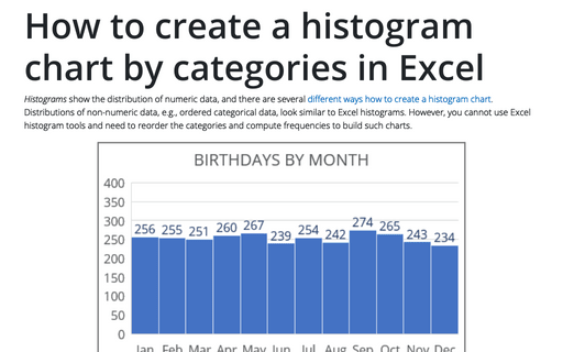
How to create a histogram chart by categories in Excel
Histograms show the distribution of numeric data, and there are several
different ways
how to create a histogram chart.
Distributions of non-numeric data, e.g., ordered categorical data, look similar to
Excel histograms. However, you cannot use Excel histogram tools and need to reorder
the categories and compute frequencies to build such charts.
How to create a simple histogram chart in Excel
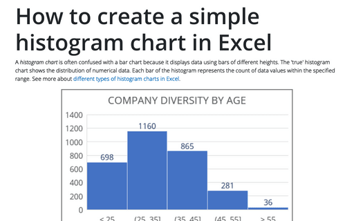
A histogram chart is often confused with a bar chart because it displays data
using bars of different heights. The 'true' histogram chart shows the distribution of
numerical data. Each bar of the histogram represents the count of data values within
the specified range. See more about
different types
of histogram charts in Excel.
How to create irregular polygon charts in Excel
Many organizations utilize 360-degree feedback (also known as multi-rater feedback, multi-source feedback, multi-source assessment, or 360-degree review) to assist employees in work and social skills development. This process includes gathering employee's subordinates, colleagues, supervisor(s), and manager(s) feedback; and comparing self-evaluation and individual group metrics.
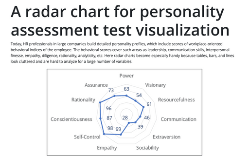
A radar chart for personality assessment test visualization
Today, HR professionals in large companies build detailed personality profiles, which include scores of workplace-oriented behavioral indices of the employee. The behavioral scores cover such areas as leadership, communication skills, interpersonal finesse, empathy, diligence, rationality, analyticity, etc. Here radar charts become especially handy because tables, bars, and lines look cluttered and are hard to analyze for a large number of variables.
How to compare strengths and weaknesses, skills, or performance metrics
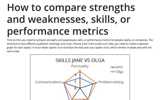
Time to time, you need to compare strengths and weaknesses, skills, or performance metrics for people, teams, or companies. The dimensions have different qualitative meanings, and, if you choose a bar chart to plot such data, you need to create a separate graph for each aspect. A much better option is to normalize the data and use a spider chart, which renders multiple axes with the same scale.
How to create an axis with subcategories
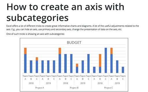
Excel offers a lot of different tricks to create great informative charts and diagrams. A lot of
the useful adjustments related to the axis. E.g., you can hide an axis, use primary and
secondary axis, change the presentation of data on the axis, etc.
How to create step chart in Excel
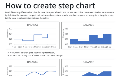
There are a lot of different pre-defined charts in Excel, but for some types of data, pre-defined
charts such as area chart or line chart can look fine but are incorrect.
Unrealized Gain and Loss
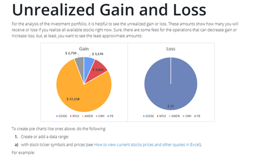
To show the unrealized gain and loss require the new Excel feature - Data Types. Unfortunately, this feature doesn’t work at the moment for Excel 2016.
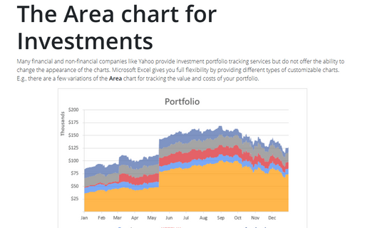
The Area chart for Investments
Many financial and non-financial companies like Yahoo provide investment portfolio tracking services
but do not offer the ability to change the appearance of the charts. Microsoft Excel gives you full
flexibility by providing different types of customizable charts. E.g., there are a few variations of
the Area chart for tracking the value and costs of your portfolio.
