Chart in Excel 2016
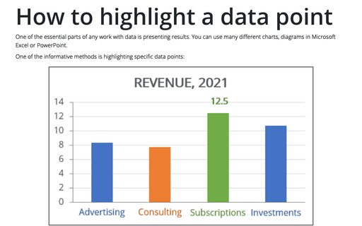
How to highlight a data point
One of the essential parts of any work with data is presenting results. You can use many different
charts, diagrams in Microsoft Excel or PowerPoint.
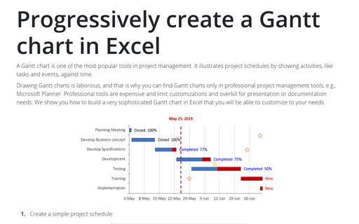
Progressively create a Gantt chart in Excel
A Gantt chart is one of the most popular tools in project management. It illustrates project schedules
by showing activities, like tasks and events, against time.
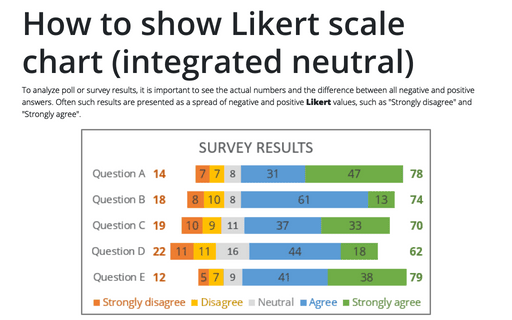
How to show Likert scale chart (integrated neutral)
When you analyze quiz answers, you need to see the numbers and the difference between all negative
and positive answers. This is not easy, if you have more than 3 possible answers - positive, neutral
and negative. However, you can create a chart that shows the whole picture:
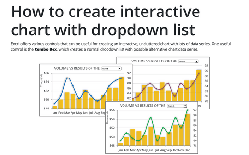
How to create interactive chart with dropdown list in Excel
Excel has a lot of different, useful features to help you to present data. There are a lot of different
charts you can create (see charts). One of the features for
presenting your data in an interactive chart with a drop-down list.
How to create interactive chart with checkboxes in Excel
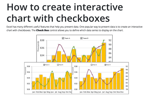
Excel has a lot of different, useful features to help you to present data. There are a lot of different
charts you can create (see charts). One of the features for presenting
your data in an interactive chart with checkboxes.
How to create interactive chart with radio or option buttons
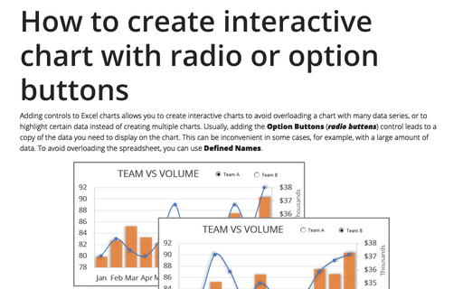
To create interactive charts, you need to add some of the controls in Microsoft Excel. This tip is about
using Option Buttons that can be easily added and customized.
How to create simple interactive chart with radio or option buttons
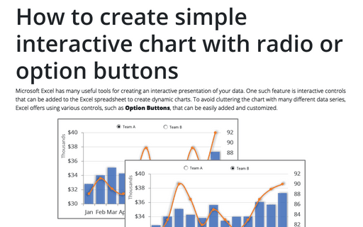
There are a lot of different features in Microsoft Excel that can be useful for creating a presentation of
your data. One of these features is interactive controls that can be added to your Excel spreadsheet to
create dynamic charts. This tip is about using Option Buttons that can be easily added and
customized.
Show chart data for empty cells
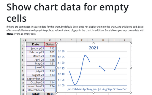
When you have some gaps in your chart data, Excel doesn't show any data for these gaps and your chart
looks odd. Instead you can show interpolated values instead of gaps in the chart.
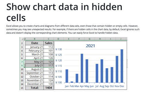
Show chart data in hidden cells
When you have some hidden cells in your chart data, Excel ignores data for these gaps and doesn't
show the corresponding chart elements.
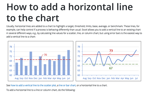
How to add a horizontal line to the chart
Sometimes you need to add a horizontal line to your chart. E.g., this will be useful to show data with some
goal line or limits:
