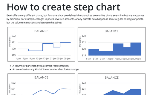
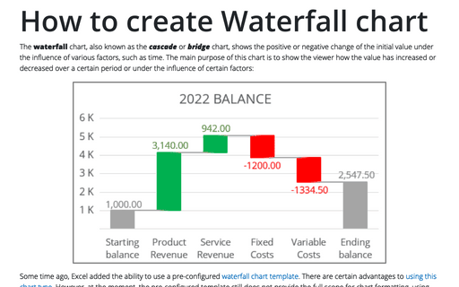
How to create step chart in Excel
For example, for the changes in prices, invested amounts, or any discrete data with the timeline bar charts give a correct representation. However, if you want to use an area chart or any kind of line, scatter chart, it looks strange:
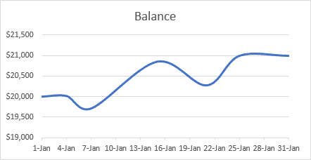
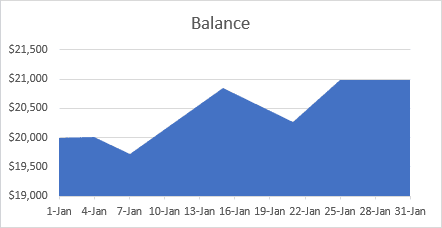
Why is this strange? It looks like the data changes every day (month, year). For this example, it seems like you deposit or withdraw some amount every day.
To create a correct step chart, you need to make one simple additional step - add the intermediate data:
For example, if the data for the chart looks like:
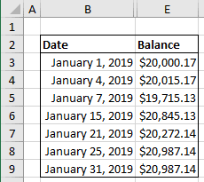
To create a step chart, you will need two values for the same date:
- the start value (previous value)
- the end value (current value).
For this example:
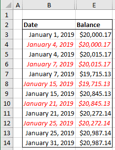
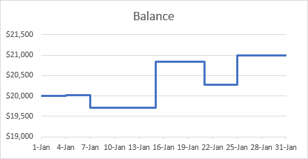
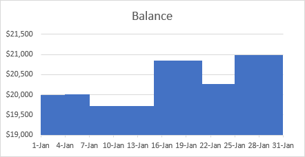
After adding the data, just create a line chart or an area chart:
See also this tip in French: Comment créer un graphique en étapes dans Excel.
