Conditional formatting for chart axes
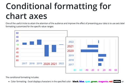
One of the useful tricks to attain the attention of the audience and improve the effect of presenting your data is to use axis label formatting customized for the specific value ranges:
How to create a comparative histogram chart in Excel
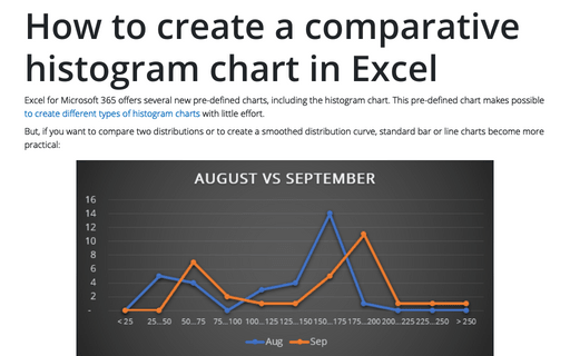
Excel for Microsoft 365 offers several new pre-defined charts, including the histogram chart. This pre-defined chart makes possible to create different types of histogram charts with little effort.
Adding error bars
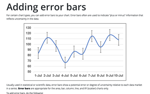
For certain chart types, you can add error bars to your chart. Error bars often are used to indicate "plus or minus" information that reflects uncertainty in the data.
Customize the horizontal axis labels
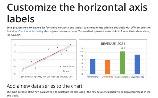
Excel provides very few options for formatting horizontal axis labels. You cannot format different axis labels with different colors or font sizes. Conditional formatting also only works in some cases. You need to implement some tricks to format the horizontal axis, for example:
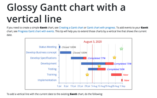
Glossy Gantt chart with a vertical line
If you need to create a simple Gantt chart, see Creating a Gantt chart or Gantt chart with progress. To add events to your Gantt chart, see Progress Gantt chart with events. This tip will help you to extend those charts by a vertical line that shows the current date.
Outlook command-line switches
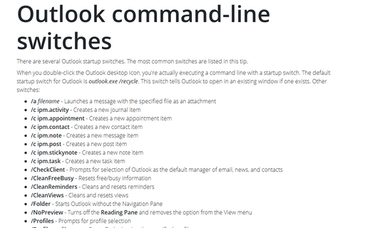
There are several Outlook startup switches. The most common switches are listed in this tip.
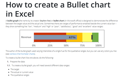
How to create a Bullet chart in Excel
A bullet graph (the name by its creator Stephen Few) or bullet chart (in Microsoft office) is designed to demonstrate the difference between the target value and the actual one. Sometimes there are ranges of performance enabled beside the current value bar – they show something like "low", "medium" and "high" or "poor", "satisfactory", "good" and "excellent" value ranges:
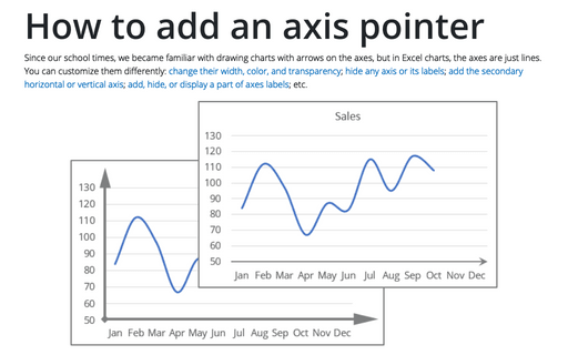
How to add an axis pointer
Since our school times, we became familiar with drawing charts with arrows on the axes, but in Excel charts, the axes are just lines. You can customize them differently: change their width, color, and transparency; hide any axis or its labels; add the secondary horizontal or vertical axis; add, hide, or display a part of axes labels; etc.
Using a custom sort order
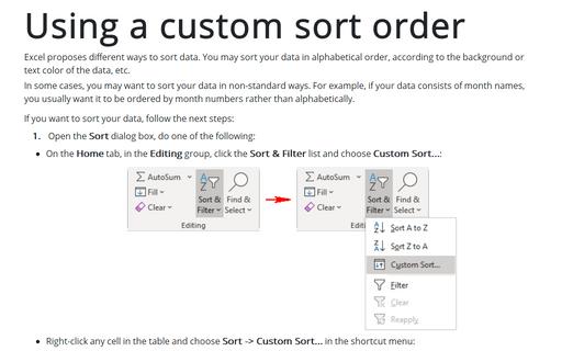
Excel proposes different ways to sort data. You may sort your data in alphabetical order, according to the background or text color of the data, etc.
In some cases, you may want to sort your data in non-standard ways. For example, if your data consists of month names, you usually want it to be ordered by month numbers rather than alphabetically.
In some cases, you may want to sort your data in non-standard ways. For example, if your data consists of month names, you usually want it to be ordered by month numbers rather than alphabetically.
How to create a break-even chart in Excel
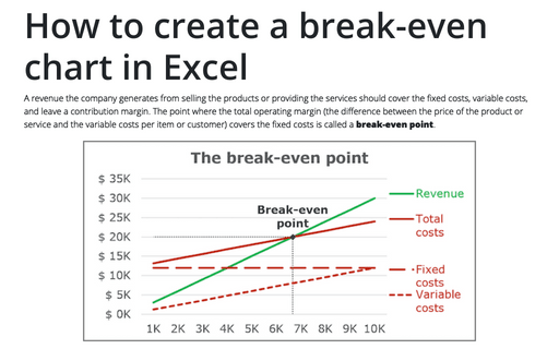
A revenue the company generates from selling the products or providing the services should cover the
fixed costs, variable costs, and leave a contribution margin. The point where the total operating
margin (the difference between the price of the product or service and the variable costs per item
or customer) covers the fixed costs is called a break-even point.
