How to create a comparative histogram chart in Excel
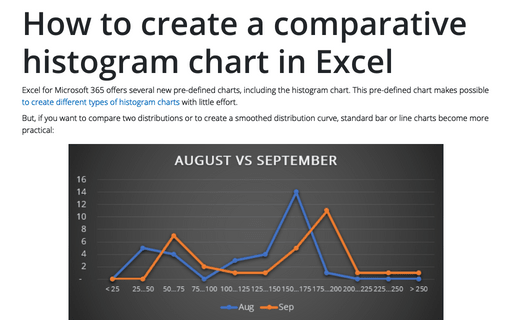
Excel for Microsoft 365 offers several new pre-defined charts, including the histogram chart. This pre-defined chart makes possible to create different types of histogram charts with little effort.
How to create shortcuts
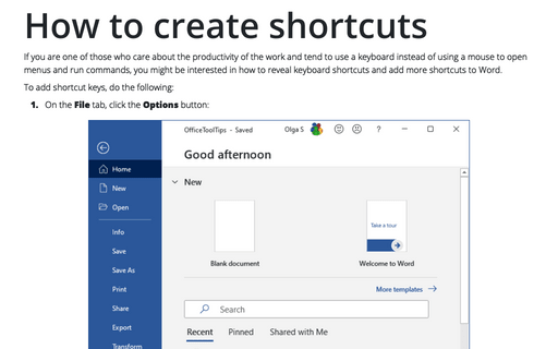
If you are one of those who care about the productivity of the work and tend to use a keyboard instead of
using a mouse to open menus and run commands, you might be interested in how to reveal keyboard shortcuts and
add more shortcuts to Word.
How to create automatic numbers and captions for figures: images, pictures, and other illustrations
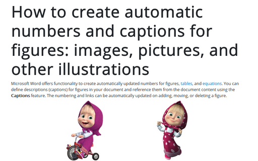
Microsoft Word offers functionality to create automatically updated numbers for figures, tables, and equations. You can define descriptions (captions) for figures in your document and reference them from the document content using the Captions feature. The numbering and links can be automatically updated on adding, moving, or deleting a figure.
How to create bar chart of the survey results
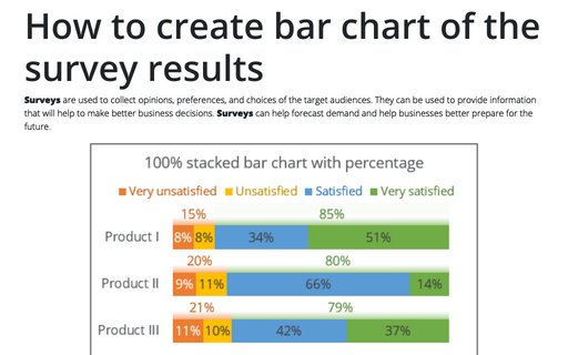
Surveys are used to collect opinions, preferences, and choices of the target audiences. They can be used to provide information that will help to make better business decisions. Surveys can help forecast demand and help businesses better prepare for the future.
How to create Table of Figures and List of Tables
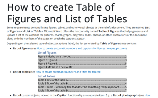
Some requirements demand listing figures, tables, and other visual objects at the end of a document. They are named List of Figures and List of Tables. Microsoft Word offers the functionality named Table of Figures that helps generate and update a list of the captions for pictures, charts, graphs, diagrams, slides, photos, or other illustrations of the document, along with the numbers of the pages on which the captions appear.
Waterfall chart
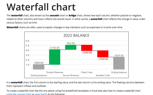
The waterfall chart, also known as the cascade chart or bridge chart, shows how each column, whether positive or negative, relates to other columns and how it affects the overall result. In other words, a waterfall chart reflects the change in value under various factors, such as time.
How to insert automatic numbers, captions, and cutlines for photos in Word
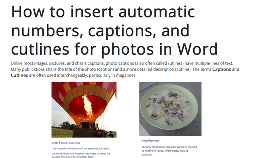
Unlike most images, pictures, and charts captions, photo captions (also often called cutlines) have multiple lines of text. Many publications share the title of the photo (caption) and a more detailed description (cutline). The terms Captions and Cutlines are often used interchangeably, particularly in magazines.
How to add Dividers to the chart
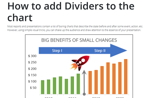
Most reports and presentations contain a lot of boring charts that describe the state before and after some
event, action, etc. However, using simple visual tricks, you can shake up the audience and draw attention
to the essence of your presentation.
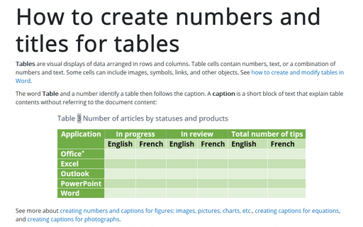
How to create numbers and titles for tables
Tables are visual displays of data arranged in rows and columns. Table cells contain numbers, text, or a combination of numbers and text. Some cells can include images, symbols, links, and other objects. See how to create and modify tables in Word.
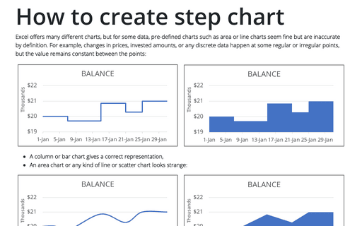
How to create step chart in Excel
Excel offers many different charts, but for some data, pre-defined charts such as area or line charts seem fine but are inaccurate by definition. For example, changes in prices, invested amounts, or any discrete data happen at some regular or irregular points, but the value remains constant between the points:
