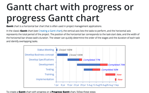
Gantt chart with progress or progress Gantt chart
Gantt chart is a horizontal bar chart that is often used in project management
applications.
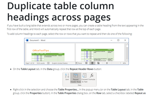
Duplicate table column headings across pages
If you have built a long table that extends across two or more pages, you can create a table heading from
the text appearing in the first row of the table, and Word will automatically repeat that row at the top of
each page.
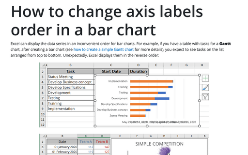
How to change axis labels order in a bar chart
Excel can display the data series in an inconvenient order for bar charts. For example, if you have a table with tasks for a Gantt chart, after creating a bar chart (see how to create a simple Gantt chart for more details), you expect to see tasks on the list arranged from top to bottom. Unexpectedly, Excel displays them in the reverse order:
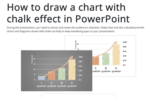
How to draw a chart with chalk effect in PowerPoint
During the presentation, you need to attract and retain the audience's attention. Slides that look like
a blackboard with charts and diagrams drawn with chalk can help to keep wandering eyes on your
presentation.
Creating picture charts
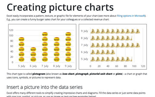
Excel easily incorporates a pattern, texture, or graphic file for elements of your chart (see more about filling options in Microsoft). E.g., you can create a funny burger sales chart for your colleagues or a collected revenue chart:
How to add labels to the Marimekko chart
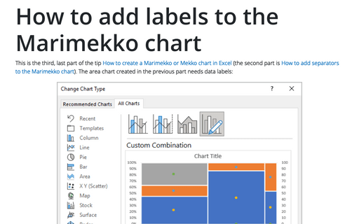
This is the third, last part of the tip How to create a Marimekko or Mekko chart in Excel (the second part is How to add separators to the Marimekko chart). The area chart created in the previous part needs data labels:
How to create interactive chart with radio or option buttons
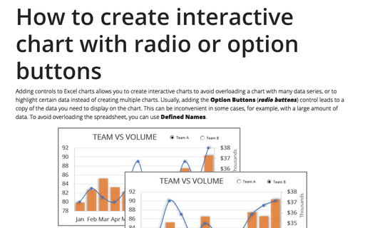
Adding controls to Excel charts allows you to create interactive charts to avoid overloading a chart with many data series, or to highlight certain data instead of creating multiple charts. Usually, adding the Option Buttons (radio buttons) control leads to a copy of the data you need to display on the chart. This can be inconvenient in some cases, for example, with a large amount of data. To avoid overloading the spreadsheet, you can use Defined Names.
How to create PowerPoint progress pie chart
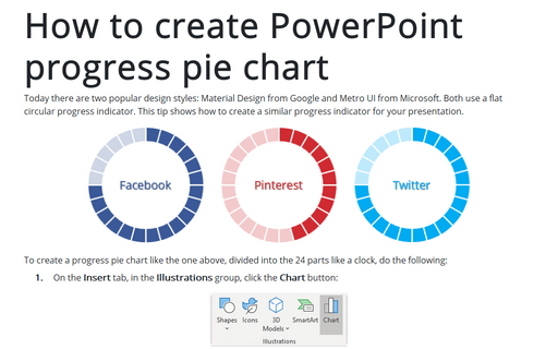
Today there are two popular design styles: Material Design from Google and Metro UI from Microsoft. Both use a flat circular progress indicator. This tip shows how to create a similar progress indicator for your presentation.
How to create a histogram chart by category using frequencies in Excel
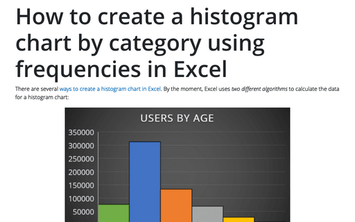
There are several ways to create a histogram chart in Excel. By the moment, Excel uses two different algorithms to calculate the data for a histogram chart:
How to create a funny dog breeds lifespan chart in Excel
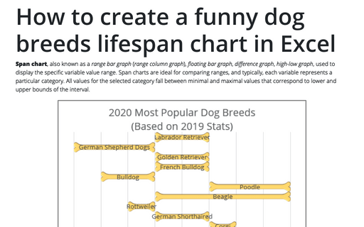
Span chart, also known as a range bar graph (range column graph), floating bar graph, difference graph, high-low graph, used to display the specific variable value range. Span charts are ideal for comparing ranges, and typically, each variable represents a particular category. All values for the selected category fall between minimal and maximal values that correspond to lower and upper bounds of the interval.
