How to print a large Excel spreadsheet
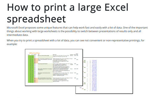
Microsoft Excel proposes some unique features that can help work fast and easily with a lot of data. One of the important things about working with large worksheets is the possibility to switch between presentations of results only and all intermediate data.
Four ways to improve your data presentation in Excel
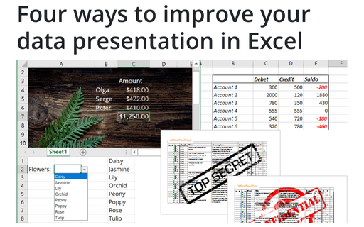
Using simple tricks, you can convert your Excel spreadsheet from a table with rows and columns to an
interactive application that will help you represent the data more appealingly and conveniently.
How to create and modify tables in Word
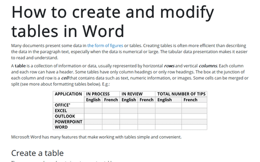
Many documents present some data in the form of figures or tables. Creating tables is often more efficient than describing the data in the paragraph text, especially when the data is numerical or large. The tabular data presentation makes it easier to read and understand.
6 charts for lively progress visualization
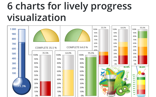
There are several different charts in Excel that can help you to create a perfect progress illustration.
Pagination breaks in a Word document
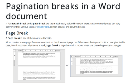
A paragraph break and a page break are the most heavily utilized breaks in Word. Less commonly used but very convenient for various tasks are line breaks, section breaks, and column breaks.
Splitting text strings without using formulas
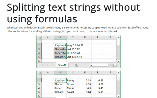
When working with data in Excel spreadsheets, it is sometimes necessary to split text lines into columns. Excel offers many different functions for working with text strings, but you don't have to use formulas for this task:
How to create dependent on a volume chart title
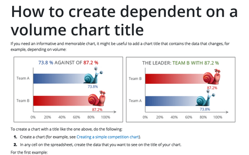
If you need an informative and memorable chart, it might be useful to add a chart title that contains the data that changes, for example, depending on volume:
How to create a multi-week calendar
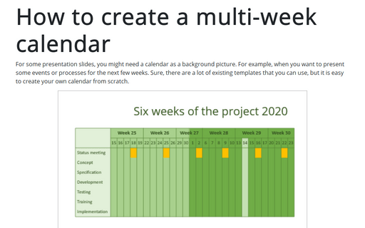
For some presentation slides, you might need a calendar as a background picture. For example, when you want to present some events or processes for the next few weeks. Sure, there are a lot of existing templates that you can use, but it is easy to create your own calendar from scratch.
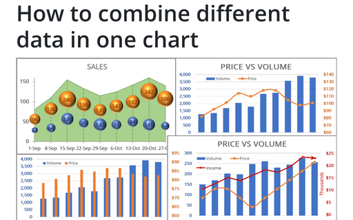
How to combine different data in one chart
To make your data more information, you can combine different chars in many ways.
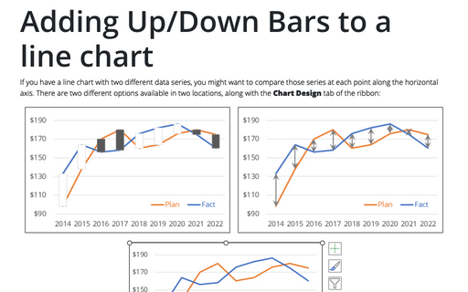
Adding Up/Down Bars to a line chart
If you have a line chart with two different data series, you might want to compare those series at each point along the horizontal axis. There are two different options available in two locations, along with the Chart Design tab of the ribbon:
