How to hide points on the chart axis
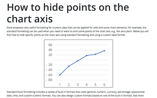
Excel proposes very useful formatting for numeric data that can be applied for cells and some chart elements. For example, the standard formatting can be used when you need or want to omit some points of the chart axis, e.g., the zero point. Below you will find how to hide specific points on the chart axis using standard formatting and using a custom label format:
Adding shapes into an Organizational Chart
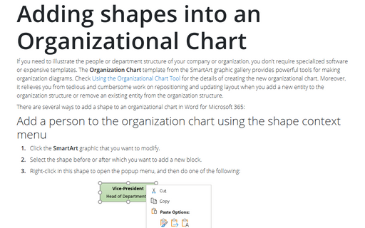
If you need to illustrate the people or department structure of your company or organization, you
don't require specialized software or expensive templates. The Organization Chart template
from the SmartArt graphic gallery provides powerful tools for making organization diagrams.
Check
Using the Organizational Chart Tool
for the details of creating the new organizational chart.
What Excel Skills are Useful to Include in a Resume?
Microsoft Excel is an integral part of today's business environment and many professional fields. This software product has become the most popular tool for data processing, analysis, and data visualization. Every day, millions of professionals around the world use Excel to solve problems of varying complexity. Excel skills often play a key role in hiring decisions. So, they can be your competitive advantage.
Text effects
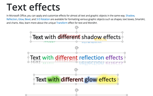
In Microsoft Office, you can apply and customize effects for almost all text and graphic objects in the same way. Shadow, Reflection, Glow, Bevel, and 3-D Rotation are available for formatting various graphic objects such as shapes, text boxes, SmartArt, and charts. Also, learn more about the unique Transform effect for text and WordArt.
How to change flowchart connector or flowline
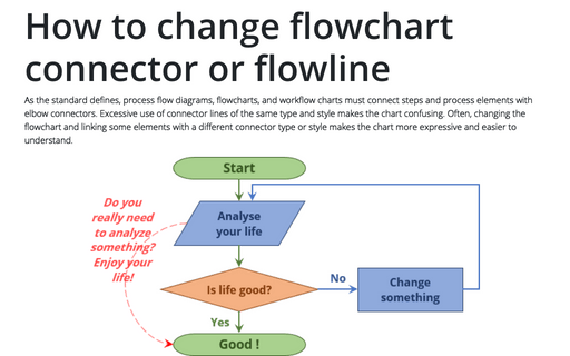
As the standard defines, process flow diagrams, flowcharts, and workflow charts must connect steps and process elements with elbow connectors. Excessive use of connector lines of the same type and style makes the chart confusing. Often, changing the flowchart and linking some elements with a different connector type or style makes the chart more expressive and easier to understand.
How to reassign a shape in the organizational chart
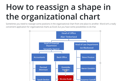
Sometimes you need to reassign some positions in the organizational chart from one place to another.
Word isn't a really convenient application for organizational charts as Excel, but you have some
possibilities to do that.
Object effect types and presets
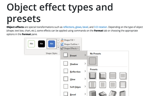
Object effects are special transformations such as reflections, glows, bevel, and 3-D rotation. Depending on the type of object (shape, text box, chart, etc.), some effects can be applied using commands on the Format tab or choosing the appropriate options on the Format pane.
How to create two vertical axes on the same side
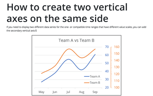
If you need to display two different data series for the one- or compatible-time ranges that have different value scales, you can add the secondary vertical axis:ß
Add radiance and softness to Pictures, Shapes, SmartArt, and Charts in Powerpoint
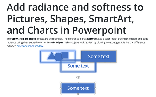
The Glow and Soft Edges effects are quite similar. The difference is that Glow creates a color “halo” around the object and adds radiance using the selected color, while Soft Edges makes objects look ”softer” by blurring object edges. It is like the difference between outer and inner shadow.
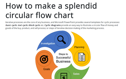
How to make a splendid circular flow chart
Iterative processes are the core of any business, and Microsoft PowerPoint provides several
templates for cyclic processes: basic cycle, text cycle,
block cycle, etc. Cyclic diagrams provide an easy way to illustrate a
circular flow of money and goods of the buy, product, and sell process; or steps of iterative
decision making of the marketing process.
