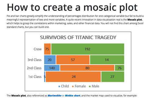
How to create a Mosaic plot in Excel
Pie and bar charts greatly simplify the understanding of percentages distribution for one categorical variable but fail to build a meaningful representation of two and more variables. A quite recent innovation in data visualization real is the Mosaic plot, which helps to grasp the correlations within marketing, sales, and other financial data. You will not find this chart among Excel standard charts, but you can build one.
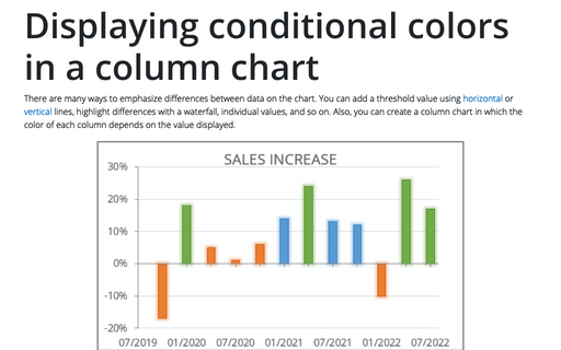
Displaying conditional colors in a column chart
There are many ways to emphasize differences between data on the chart. You can add a threshold value using horizontal or vertical lines, highlight differences with a waterfall, individual values, and so on. Also, you can create a column chart in which the color of each column depends on the value displayed.
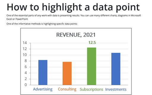
How to highlight a data point
One of the essential parts of any work with data is presenting results. You can use many different
charts, diagrams in Microsoft Excel or PowerPoint.
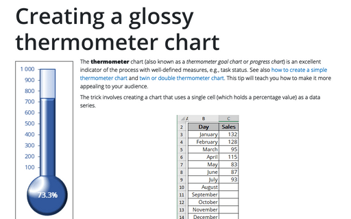
Creating a glossy thermometer chart
The thermometer chart (also known as a thermometer goal chart or progress chart) is an excellent indicator of the process with well-defined measures, e.g., task status. See also how to create a simple thermometer chart and twin or double thermometer chart. This tip will teach you how to make it more appealing to your audience.
Creating a rainbow thermometer chart
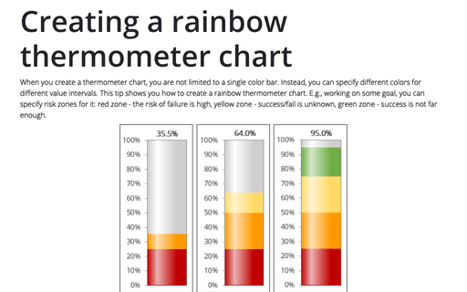
When you create a thermometer chart, you are not limited to a single color bar. Instead, you can specify different colors for different value intervals. This tip shows you how to create a rainbow thermometer chart. E.g., working on some goal, you can specify risk zones for it: red zone - the risk of failure is high, yellow zone - success/fail is unknown, green zone - success is not far enough.
Creating a semaphore thermometer chart
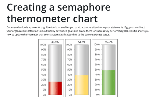
Data visualization is a powerful cognitive tool that enables you to attract more attention to your statements. E.g., you can direct your organization's attention to insufficiently developed goals and praise them for successfully performed goals. This tip shows you how to update thermometer char colors automatically according to the current process status.
How to compare strengths and weaknesses, skills, or performance metrics
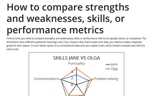
Time to time, you need to compare strengths and weaknesses, skills, or performance metrics for people, teams, or companies. The dimensions have different qualitative meanings, and, if you choose a bar chart to plot such data, you need to create a separate graph for each aspect.
Customize the horizontal axis labels
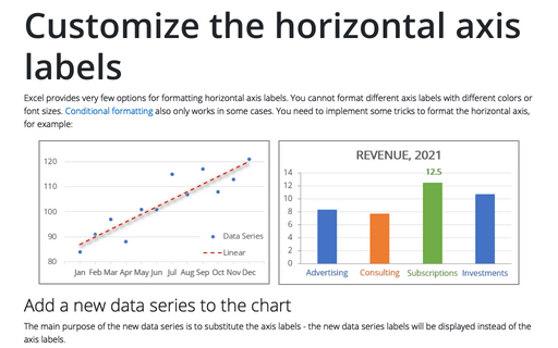
Excel provides very few options for formatting horizontal axis labels. You cannot format different axis labels with different colors or font sizes. Conditional formatting also only works in some cases. You need to implement some tricks to format the horizontal axis, for example:
How to customize Navigation bar in Outlook
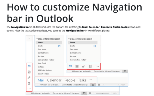
The Navigation bar in Outlook includes the buttons for switching to Mail, Calendar, Contacts, Tasks, Notes views, and others. After the last Outlook updates, you can see the Navigation bar in two different places:
How to create re-sorting chart in Excel
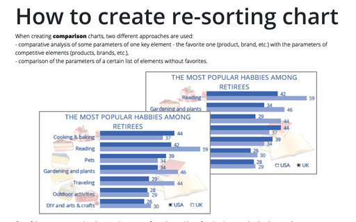
When creating comparison charts, two different approaches are used:
- comparative analysis of some parameters of one key element - the favorite one (product, brand, etc.) with the parameters of competitive elements (products, brands, etc.),
- comparison of the parameters of a certain list of elements without favorites.
- comparative analysis of some parameters of one key element - the favorite one (product, brand, etc.) with the parameters of competitive elements (products, brands, etc.),
- comparison of the parameters of a certain list of elements without favorites.
