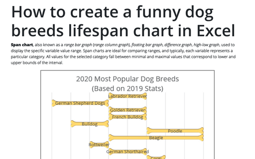
How to create a funny dog breeds lifespan chart in Excel
Span chart, also known as a range bar graph (range column graph), floating bar graph, difference graph, high-low graph, used to display the specific variable value range. Span charts are ideal for comparing ranges, and typically, each variable represents a particular category. All values for the selected category fall between minimal and maximal values that correspond to lower and upper bounds of the interval.
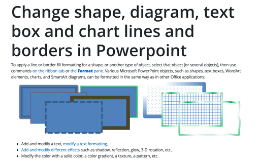
Change shape, diagram, text box and chart lines and borders in Powerpoint
To apply a line or border fill formatting for a shape, or another type of object, select that object (or several objects), then use commands on the ribbon tab or the Format pane. Various Microsoft PowerPoint objects, such as shapes, text boxes, WordArt elements, charts, and SmartArt diagrams, can be formatted in the same way as in other Office applications:
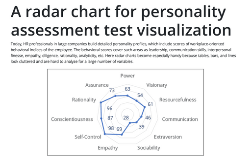
A radar chart for personality assessment test visualization
Today, HR professionals in large companies build detailed personality profiles, which include scores of workplace-oriented behavioral indices of the employee. The behavioral scores cover such areas as leadership, communication skills, interpersonal finesse, empathy, diligence, rationality, analyticity, etc.
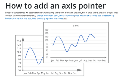
How to add an axis pointer
Since our school times, we became familiar with drawing charts with arrows on the axes, but in Excel charts, the axes are just lines. You can customize them differently: change their width, color, and transparency; hide any axis or its labels; add the secondary horizontal or vertical axis; add, hide, or display a part of axes labels; etc.
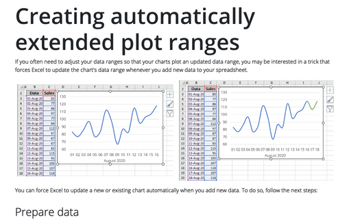
Creating automatically extended plot ranges
If you often need to adjust your data ranges so that your charts plot an updated data range, you may be interested in a trick that forces Excel to update the chart's data range whenever you add new data to your spreadsheet.
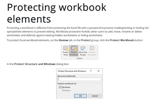
Protecting workbook elements
Protecting a workbook is different from protecting the Excel file with a password to prevent reading/writing or locking the spreadsheet elements to prevent editing. Workbook protection forbids other users to add, move, rename or delete worksheets and defends against viewing hidden worksheets or hiding worksheets.
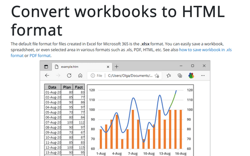
Convert workbooks to HTML format
The default file format for files created in Excel for Microsoft 365 is the .xlsx format. You can easily save a workbook, spreadsheet, or even selected area in various formats such as .xls, PDF, HTML, etc. See also how to save workbook in .xls format or PDF format.
How to add a word to the custom dictionary to avoid spelling errors
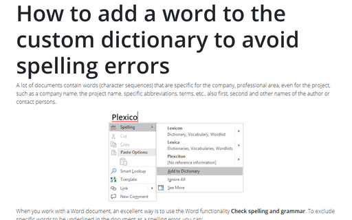
A lot of documents contain words (character sequences) that are specific for the company,
professional area, even for the project, such as a company name, the project name, specific
abbreviations, terms, etc., also first, second and other names of the author or contact persons.
How to combine shapes to create a custom shape
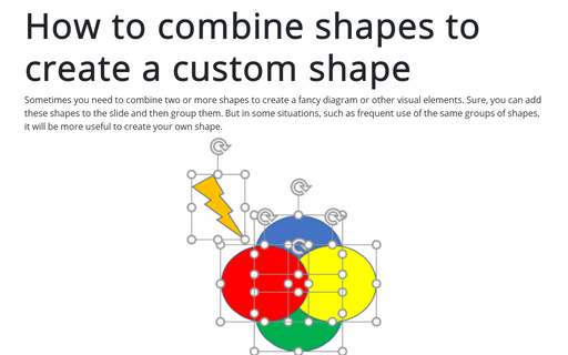
Sometimes you need to combine two or more shapes to create a fancy diagram or other visual elements. Sure, you can add these shapes to the slide and then group them. But in some situations, such as frequent use of the same groups of shapes, it will be more useful to create your own shape.
