Excel 365
Waterfall chart
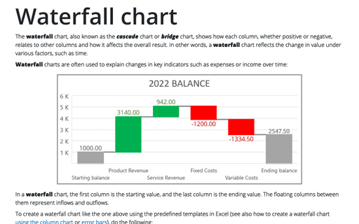
The waterfall chart, also known as the cascade chart or bridge chart, shows how each column, whether positive or negative, relates to other columns and how it affects the overall result. In other words, a waterfall chart reflects the change in value under various factors, such as time.
How to create Waterfall chart
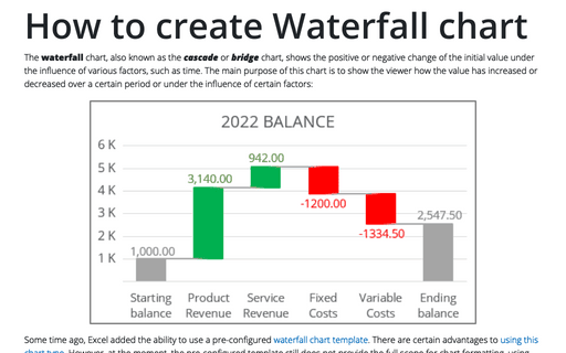
The waterfall chart, also known as the cascade or bridge chart, shows the positive or negative change of the initial value under the influence of various factors, such as time. The main purpose of this chart is to show the viewer how the value has increased or decreased over a certain period or under the influence of certain factors:
How to view geography information in Excel
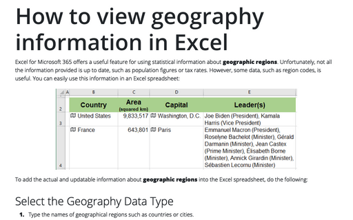
Excel for Microsoft 365 offers a useful feature for using statistical information about geographic regions. Unfortunately, not all the information provided is up to date, such as population figures or tax rates. However, some data, such as region codes, is useful. You can easily use this information in an Excel spreadsheet:
How to view currency exchange rates in Excel
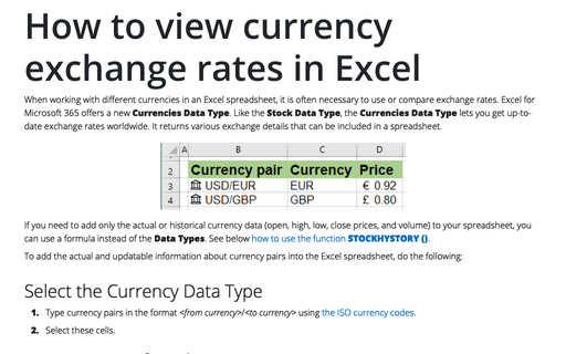
When working with different currencies in an Excel spreadsheet, it is often necessary to use or compare exchange rates. Excel for Microsoft 365 offers a new Currencies Data Type. Like the Stock Data Type, the Currencies Data Type lets you get up-to-date exchange rates worldwide. It returns various exchange details that can be included in a spreadsheet.
How to view historical stock prices and currency rates in Excel
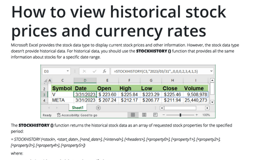
Microsoft Excel provides the stock data type to display current stock prices and other information. However, the stock data type doesn't provide historical data. For historical data, you should use the STOCKHISTORY () function that provides all the same information about stocks for a specific date range.
How to view current stock prices and other quotes in Excel
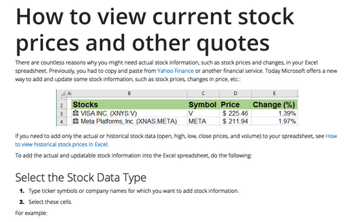
There are countless reasons why you might need actual stock information, such as stock prices and changes, in your Excel spreadsheet. Previously, you had to copy and paste from Yahoo Finance or another financial service.
Bubble chart
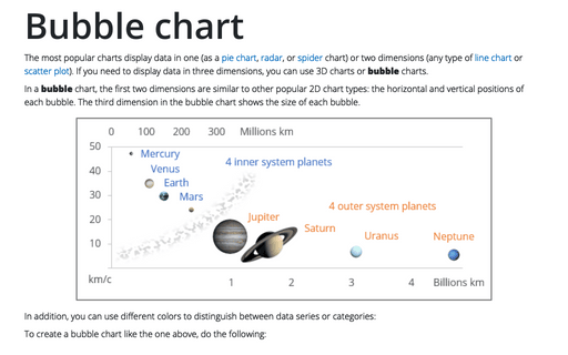
The most popular charts display data in one (as a pie chart, radar, or spider chart) or two dimensions (any type of line chart or scatter plot). If you need to display data in three dimensions, you can use 3D charts or bubble charts.
Bubble and Area chart
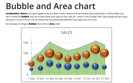
Combination charts are a great opportunity to create a really creative and memorable data presentation. Unfortunately, you can't choose the Bubble chart as an alternative chart type for line, area, etc. charts in the Change Chart Type dialog box (see Using two axes in the one chart). This tip shows how to combine two different chart types into one chart.
Speedometer chart
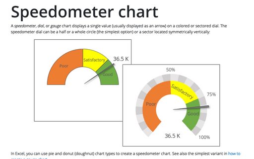
A speedometer, dial, or gauge chart displays a single value (usually displayed as an arrow) on a colored or sectored dial. The speedometer dial can be a half or a whole circle (the simplest option) or a sector located symmetrically vertically:
How to create Master and Scrolled Detail charts
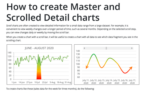
Scroll charts are often created to view detailed information for a small data range from a large dataset. For example, it is convenient to view weekly changes over a longer period of time, such as several months. Depending on the selected scroll step, you can view changes daily or weekly by moving the scroll bar.
