Excel 365
How to create a simple Bullet graph in Excel
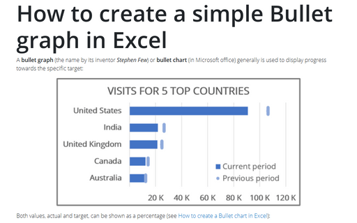
A bullet graph (the name by its inventor Stephen Few) or bullet chart (in Microsoft office) generally is used to display progress towards the specific target:
How to evaluate startup or new business plans
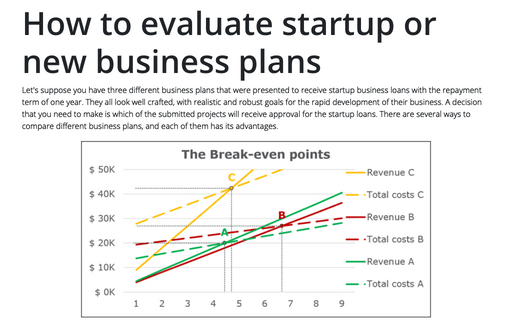
Let's suppose you have three different business plans that were presented to receive startup business loans with the repayment term of one year. They all look well crafted, with realistic and robust goals for the rapid development of their business. A decision that you need to make is which of the submitted projects will receive approval for the startup loans. There are several ways to compare different business plans, and each of them has its advantages.
How to plot investment opportunity zones in Excel
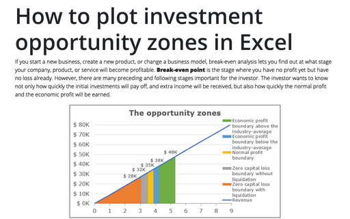
If you start a new business, create a new product, or change a business model, break-even analysis lets you find out at what stage your company, product, or service will become profitable. Break-even point is the stage where you have no profit yet but have no loss already. However, there are many preceding and following stages important for the investor. The investor wants to know not only how quickly the initial investments will pay off, and extra income will be received, but also how quickly the normal profit and the economic profit will be earned.
How to create a break-even chart in Excel
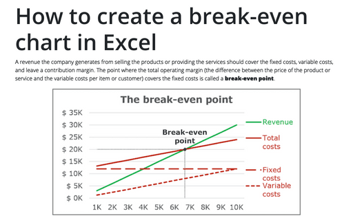
A revenue the company generates from selling the products or providing the services should cover the
fixed costs, variable costs, and leave a contribution margin. The point where the total operating
margin (the difference between the price of the product or service and the variable costs per item
or customer) covers the fixed costs is called a break-even point.
Creating a drop-down list in a cell
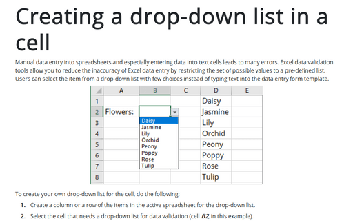
Manual data entry into spreadsheets and especially entering data into text cells
leads to many errors. Excel data validation tools allow you to reduce the inaccuracy
of Excel data entry by restricting the set of possible values to a pre-defined list.
Users can select the item from a drop-down list with few choices instead of typing
text into the data entry form template.
Change the decimal point to a comma or vice versa
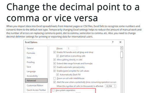
When you import data into Excel spreadsheets from Internet pages or CSV files, Excel fails to recognize some numbers and converts them to the default text type. Temporarily changing Excel settings helps to reduce the amount of manual work and the number of errors on replacing comma to point, dot to comma, semicolon to comma, etc. Also, you need to change decimal delimiter settings for printing or exporting data for international users.
How to create a Heatmap chart in Excel
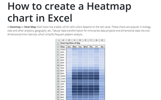
A Heatmap or Heat Map chart looks like a table, which cells colors
depend on the cell value. These charts are popular in biology, web and other analytics,
geography, etc. Tabular data transformation for time series data projects one-dimensional
data into two-dimensional time matrices, which simplify frequent pattern analysis.
How to create different types of histogram charts in Excel
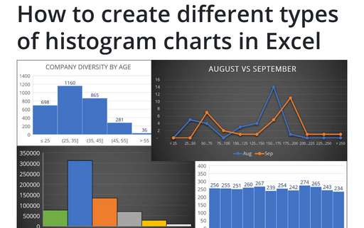
A histogram chart visualizes the distribution of continuous data. Each column in the histogram chart represents the frequency (amount) of the data within the specific range.
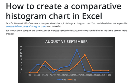
How to create a comparative histogram chart in Excel
Excel for Microsoft 365 offers several new pre-defined charts, including the histogram chart. This pre-defined chart makes possible to create different types of histogram charts with little effort.
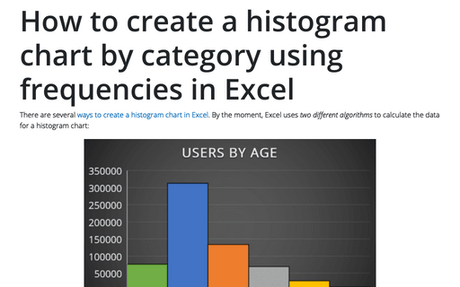
How to create a histogram chart by category using frequencies in Excel
There are several ways to create a histogram chart in Excel. By the moment, Excel uses two different algorithms to calculate the data for a histogram chart:
