Excel 2016
Creating a glossy thermometer chart
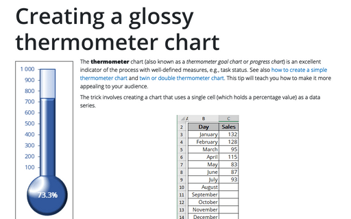
The thermometer chart is an excellent indicator of the process with well-defined measures, e.g., task status. How to
create a simple thermometer chart, see
Creating a simple thermometer chart.
This tip will teach you how to make it more appealing for your audience.
Creating a Candlestick Stock chart with volume
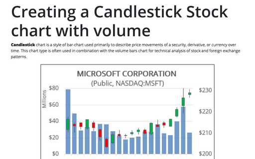
Candlestick chart is a style of bar-chart used primarily to describe price movements of a security,
derivative, or currency over time. This chart type is often used in combination with the volume bars chart
for technical analysis of stock and foreign exchange patterns.
Creating a Candlestick Stock chart
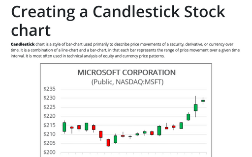
Candlestick chart is a style of bar-chart used primarily to describe price movements of a security,
derivative, or currency over time. It is a combination of a line-chart and a bar-chart, in that each bar
represents the range of price movement over a given time interval. It is most often used in technical
analysis of equity and currency price patterns.
Combining several charts into one chart
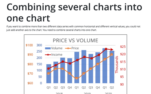
If you want to combine more than two different data series with common horizontal and different vertical
values, you could not just add another axis to the chart. You need to combine several charts into one chart.
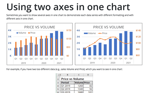
Using two axes in one chart
Sometimes you want to show several axes in one chart to demonstrate each data series with different
formatting and with different axis in one chart.
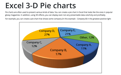
Excel 3-D Pie charts
This tip is about how to create a pie chart such as in popular glossy magazines.
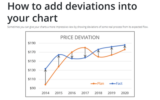
How to add deviations into your chart
Sometimes you can give your charts a more impressive view by showing deviations of some real process from its
expected flow.
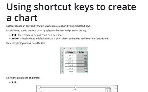
Using shortcut keys to create a chart
Excel proposes an easy and very fast way to create a chart by using shortcut keys.
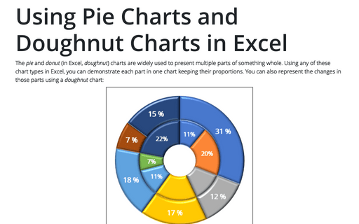
Using Pie Charts and Doughnut Charts in Excel
If you have several parts of something one, you can demonstrate each item in one pie chart. But sometimes
you want to demonstrate the changes in those parts, and a doughnut chart will help you to do this.
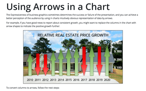
Using Arrows in a Chart
The Expressiveness of business graphics sometimes determines the success or failure of the presentation,
and you can achieve a better perception of the audience by using in charts intuitively obvious representation
of data by arrows.
