Shape in Excel 2016
Creating a twin or double thermometer chart
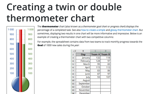
The thermometer chart displays the percentage of a task that's completed. See also
how to create a simple thermometer chart,
and
how to create a glossy thermometer chart.
But sometimes it will be more informative to display two results in one chart.
This tip is how to create a thermometer chart with two competitive columns.
Creating a glossy thermometer chart
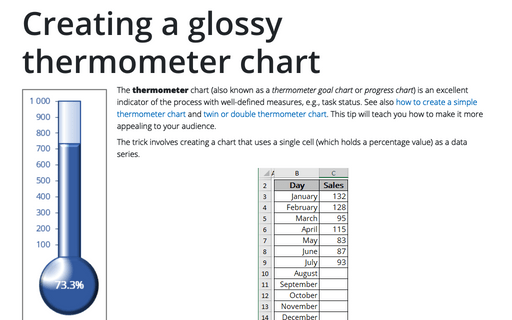
The thermometer chart is an excellent indicator of the process with well-defined measures, e.g., task status. How to
create a simple thermometer chart, see
Creating a simple thermometer chart.
This tip will teach you how to make it more appealing for your audience.
Using Arrows in a Chart
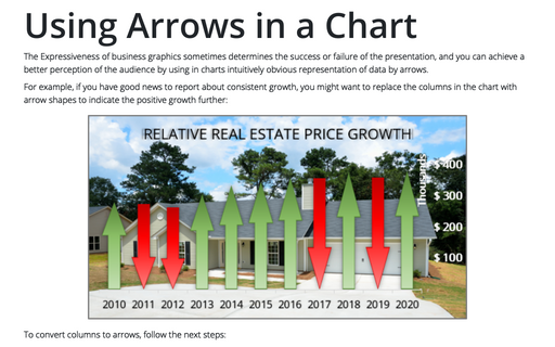
The Expressiveness of business graphics sometimes determines the success or failure of the presentation,
and you can achieve a better perception of the audience by using in charts intuitively obvious representation
of data by arrows.
Formatting comments
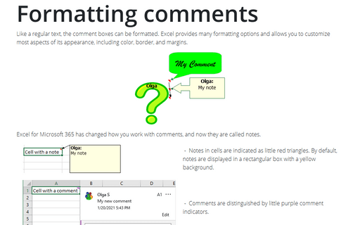
Like a common text, any comments can be formatted: Excel represents many allows you to customize most
aspects of its appearance, including color, border, and margins.
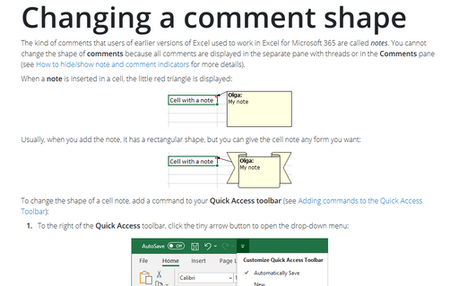
Changing a comment shape
Normally, cell comments are rectangular, but you can give a cell comment any shape you want:
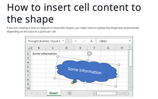
How to insert cell content to the shape
If you are creating a chart or diagram in Excel with shapes, you might need to update the shape text
automatically depending on the value in a particular cell.
