Simple combination chart
Excel 365 2016
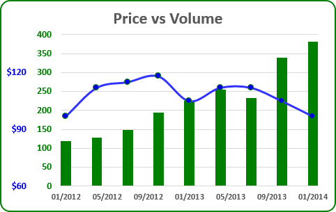
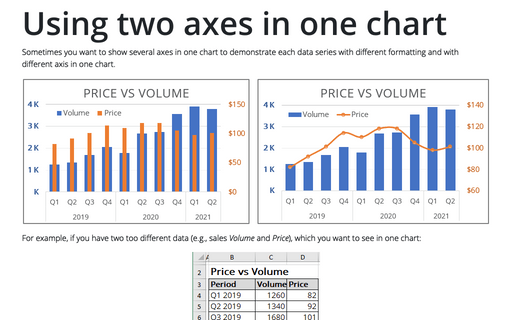
Sometimes you want to show a single chart that consists of series that use different chart types.
Combination chart in Excel 2013

For example, if you have two different volumes (e.g., volume of sales in unit A and in unit B) and you want to see in one chart the dynamic of their sales:
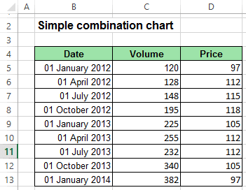
Data range in Excel 2013

To create one chart for this data, follow these steps:

   1.   Select the data range (in this example - cells B4:D13).

   2.   On the Insert tab, in the Charts group, click Combo:

Combo charts in Excel 2013

   3.   In the proposed list choose Clustered Column - Line in Secondary Axis.

   4.   Modify this chart.

How to add next data series with another axis, see Combining several charts into one chart.
Please, disable AdBlock and reload the page to continue

Today, 30% of our visitors use Ad-Block to block ads.We understand your pain with ads, but without ads, we won't be able to provide you with free content soon. If you need our content for work or study, please support our efforts and disable AdBlock for our site. As you will see, we have a lot of helpful information to share.

We use cookies to personalise content and ads, to provide social media features and to analyse our traffic. We also share information about your use of our site with our social media, advertising and analytics partners who may combine it with other information you’ve provided to them or they’ve collected from your use of their services.

Learn more