Creating a simple thermometer chart
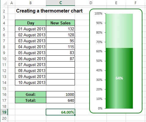
The trick involves creating a chart that uses a single cell (which holds a percentage value) as a data series.
For example, a worksheet set up to track daily progress toward a goal: 1,000 new sales in a 10-day period. Cell C16 contains the goal value, and cell C17 contains a simple sum formula:
= SUM (C5:C14)
Cell B18 contains a formula that calculates the percent of goal:
= C17 / C16
To create the chart like this one, do the following:
1. Select cell C19.
Notice the blank row before cell C19. Without this blank row, Excel uses the entire data block for the chart, not just the single cell. Because C19 is isolated from the other data, the Chart Wizard uses only the single cell.
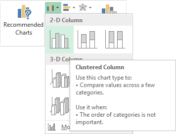
2. On the Insert tab, in the Charts group, choose the Column button:

Choose Clustered Column:
3. Remove the (x) axis.
4. To make the column occupy the entire width of the plot area, double-click the column to display the Format Data Point task pane (or choose it in the popup menu). Then in the Series Options tab, change the Gap Width setting:
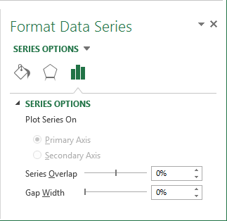
Set the Gap width to 0.
5. In the popup menu of axis choose Format Axis...:
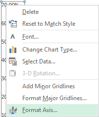
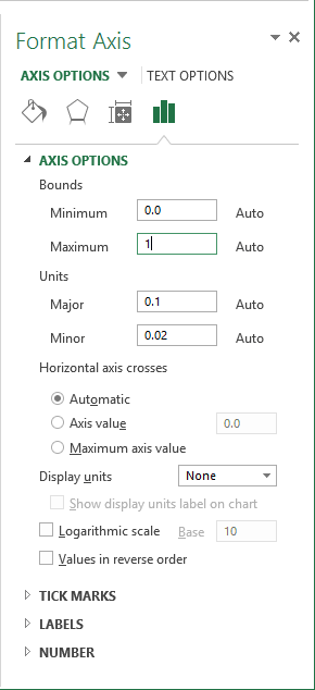
On the Format Axis task pane, in the Axis Options tab, set the Minimum to 0 and the Maximum to 1:
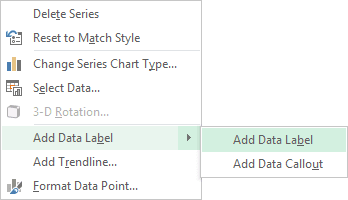
6. In the popup menu select Add Data Label and again Add Data Label:
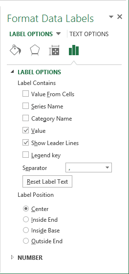
7. Then in the popup menu select Format Data Label... to display Format Data Label task pane.
8. On the Format Data Label task pane, on the Label Options tab:
- In the Label Contains group, check Value
- In the Label Position group, check Center
You can also change the label format on the Number tab, for more details see Conditional formatting of chart axes. Make any other adjustments to get the look you desire.
