Using two axes in one chart
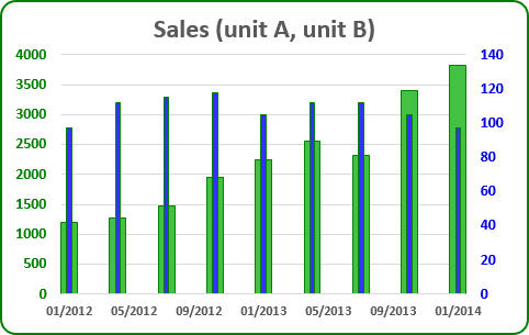
For example, if you have two too different data (e.g., sales in Unit A and in Unit B), which you want to see in one chart:
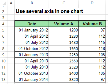
To create one chart for this data, follow these steps:
1. Create the chart with that data range:
For example, on the Insert tab, in the Charts group, choose the Column button:

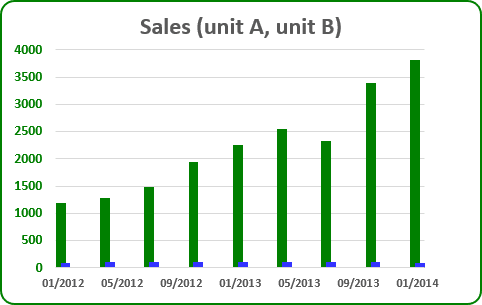
Choose Clustered Column. You can see not informative chart because of too different amounts:
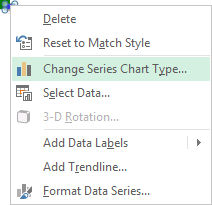
2. Right-click in the second (Unit B) data series, in the popup menu select Change Series Chart Type...:
3. In the Change Chart Type dialog box, in the Combo group of charts, choose secondary axis for second data series:
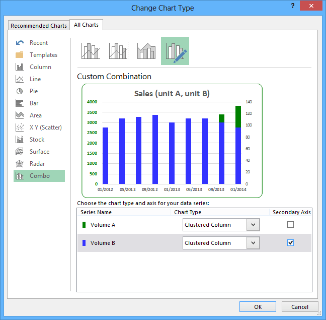
Change other parameters for the secondary axis.
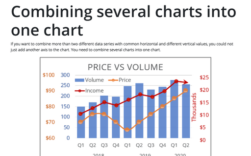
How to add next data series with another axis, see Combining several charts into one chart.
