How to create different types of histogram charts in Excel
Excel
365
A histogram chart visualizes the distribution of continuous data. Each column in the histogram chart represents the frequency (amount) of the data within the specific range.
The main differences between a histogram chart and a regular column chart are:
- a column (bar) graph describes two variables:
- the horizontal axis shows the items and
- the vertical axis shows their values,
- a histogram describes only one variable:
- the horizontal axis shows the value ranges,
- the vertical axis shows the frequencies of values within the range.
Histograms help evaluate visually where values are concentrated, what are the extreme values, and the generic shape of the distribution of the values.
In the previous versions of Excel, to create a histogram chart, it was necessary to calculate frequencies of each item (interval) and create a column or a bar chart with two parameters: items and their frequencies. Excel for Microsoft 365 offers several different ways to create histogram charts:
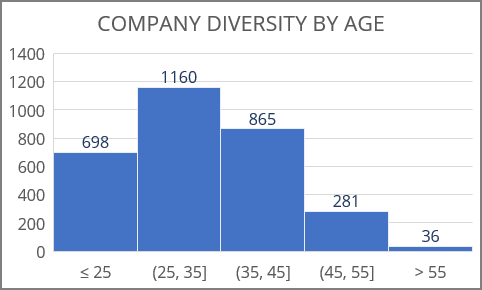
- A simple histogram chart summarizes one column or row of the numeric data, where the chart bars show the intervals of numeric data:
- A histogram chart by categories (for non-numeric data) can be created using:
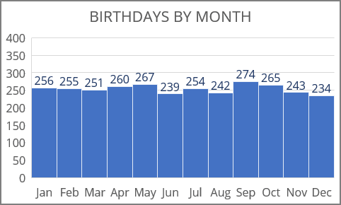
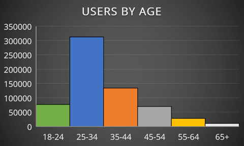
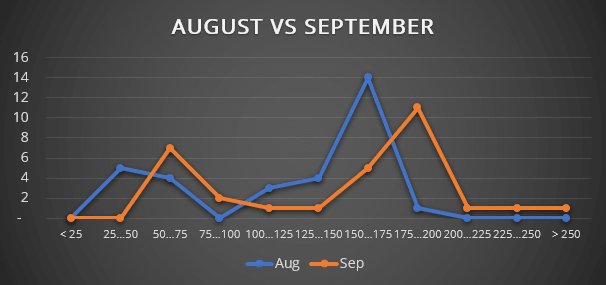
- A non-standard histogram chart is a way to create a histogram chart in other Excel versions, compare two histograms, and create a smoothed distribution plot:
