How to create a comparative histogram chart in Excel
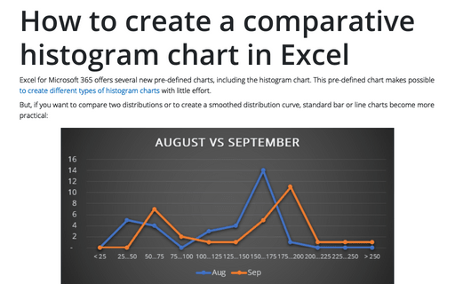
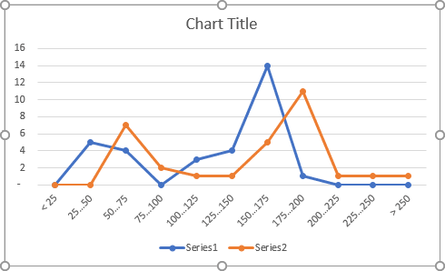
But, if you want to compare two distributions or to create a smoothed distribution curve, standard bar or line charts become more practical:
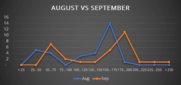
In this example, the histogram chart shows the distribution of the daily revenue for two months.
To create a histogram chart like the one above, do the following:
1. Add the new data for the chart:
Take the data of the daily revenue for two months:

Create a new data set for the histograms:
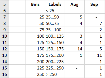
where:
- Column Bins contains the array with the upper bounds for each interval ("bin") of grouped values. Thus, all values greater than the upper bound of the previous interval and less or equal to the upper bound of the current interval fall into the current bin. All values greater than the last value of upper bounds array fall into the last bin.
Note: You can define bins with different widths.
- Column Labels contains the array of labels for the horizontal axis.
- Column Aug created using the formula:
{= FREQUENCY (<data>, <bins>)}
The FREQUENCY () function returns a frequency distribution table, a table containing the number of elements from the <data> array included in each interval of the <bins> array.
This function returns multiple values and should be entered as an array formula using Ctrl+Enter.
Note: If you don't familiar with array functions, you can use the following function to do the same calculations as the FREQUENCY () function does:
= COUNTIF (<data>, <criteria>)
See more about function COUNTIF.
So, for this example:
D6: = COUNTIF (B2:AF2, "<25")
D7: = COUNTIF (B2:AF2, ">25") - COUNTIF (B2:AF2, ">50")
D8: = COUNTIF (B2:AF2, ">50") - COUNTIF (B2:AF2, ">75")
etc.
2. Create a histogram chart:
2.1. Select the prepared data (in this example, C5:E16).
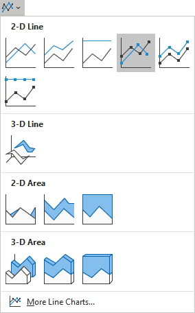
2.2. On the Insert tab, in the Charts group, click on the Insert Line or Area Chart button:

Select Line with Markers:
Excel creates a nice distribution chart for the data:
Make any other adjustment you desire.
