How to create a Scrolling chart
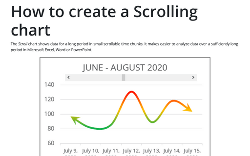
The Scroll chart shows data for a long period in small scrollable time chunks. It makes easier to analyze data over a sufficiently long period in Microsoft Excel, Word or PowerPoint.
The Scroll chart displays some contiguous range of data from a large dataset. Using the provided Control tools, it is possible to add a scroll bar to the chart area and view the desired data range:
The Scroll chart displays some contiguous range of data from a large dataset. Using the provided Control tools, it is possible to add a scroll bar to the chart area and view the desired data range:
Creating a chart with critical zones
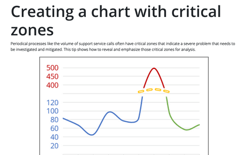
Periodical processes like the volume of support service calls often have critical zones that indicate a severe problem that needs to be investigated and mitigated. This tip shows how to reveal and emphasize those critical zones for analysis.
How to create a simple Bullet graph in Excel
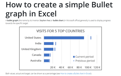
A bullet graph (the name by its inventor Stephen Few) or bullet chart (in Microsoft office) generally is used to display progress towards the specific target:
How to add the effect of falling Jigsaw puzzle pieces
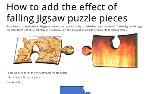
If you have mastered realistic 3D Jigsaw puzzles, then you are ready to make them even more vivid. The background image will make them look like real Jigsaw puzzles from eBay. The 3D rotation will add dynamics to the falling pieces.
How to create a span chart in Excel
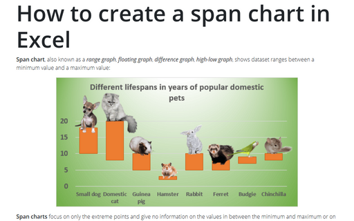
Span chart, also known as a range graph, floating graph, difference graph, high-low graph, shows dataset ranges between a minimum value and a maximum value:
Bubble and Area chart
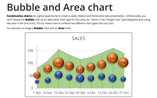
Combination charts are a great opportunity to create a really creative and memorable data presentation. Unfortunately, you can't choose the Bubble chart as an alternative chart type for line, area, etc. charts in the Change Chart Type dialog box (see Using two axes in the one chart). This tip shows how to combine two different chart types into one chart.
Creating a gauge chart
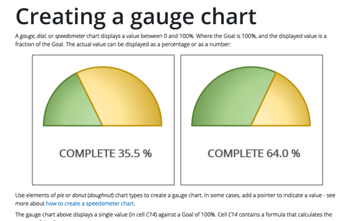
A gauge, dial, or speedometer chart displays a value between 0 and 100%. Where the Goal is 100%, and the displayed value is a fraction of the Goal. The actual value can be displayed as a percentage or as a number:
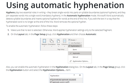
Using automatic hyphenation
Hyphens play two essential roles in writing – they break single words into parts on
syllable boundaries (optional hyphens), and they join separate words into a single
word (mandatory hyphens). In the Automatic hyphenation mode, Microsoft Word
automatically detects syllable boundaries and inserts optional hyphens for words at
the end of the line. If you edit the text in a way that the hyphenated word is no
longer at the end of the line, Word removes the optional hyphen.
Customize the vertical axis labels
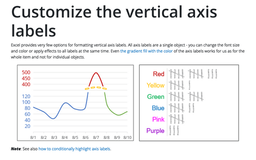
Excel provides very few options for formatting vertical axis labels. All axis labels are a single object - you can change the font size and color or apply effects to all labels at the same time. Even the gradient fill with the color of the axis labels works for us as for the whole item and not for individual objects.
