How to show Likert scale chart (integrated neutral)
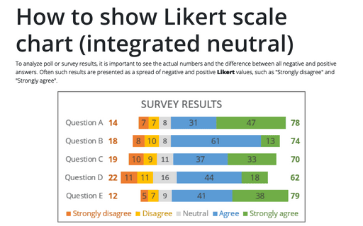
To analyze poll or survey results, it is important to see the actual numbers and the difference between all negative and positive answers. Often such results are presented as a spread of negative and positive Likert values, such as "Strongly disagree" and "Strongly agree".
How to create a histogram chart by categories in Excel
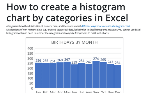
Histograms show the distribution of numeric data, and there are several different ways how to create a histogram chart. Distributions of non-numeric data, e.g., ordered categorical data, look similar to
Excel histograms. However, you cannot use Excel histogram tools and need to reorder the categories and compute frequencies to build such charts.
Speedometer chart
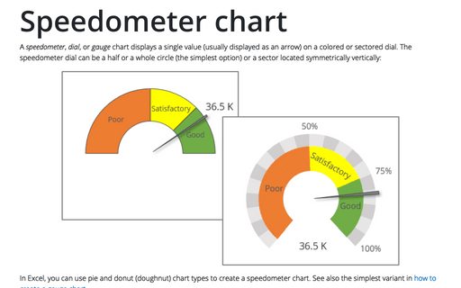
A speedometer, dial, or gauge chart displays a single value (usually displayed as an arrow) on a colored or sectored dial. The speedometer dial can be a half or a whole circle (the simplest option) or a sector located symmetrically vertically:
How to create a Mosaic plot in Excel
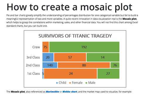
Pie and bar charts greatly simplify the understanding of percentages distribution for one categorical variable but fail to build a meaningful representation of two and more variables. A quite recent innovation in data visualization real is the Mosaic plot, which helps to grasp the correlations within marketing, sales, and other financial data. You will not find this chart among Excel standard charts, but you can build one.
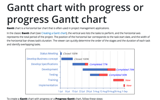
Gantt chart with progress or progress Gantt chart
Gantt chart is a horizontal bar chart that is often used in project management
applications.
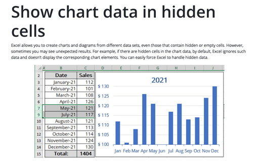
Show chart data in hidden cells
Excel allows you to create charts and diagrams from different data sets, even those that contain hidden or empty cells. However, sometimes you may see unexpected results. For example, if there are hidden cells in the chart data, by default, Excel ignores such data and doesn't display the corresponding chart elements. You can easily force Excel to handle hidden data.
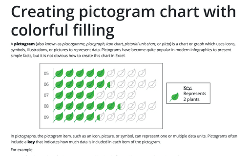
Creating pictogram chart with colorful filling
A pictogram (also known as pictorgamme, pictograph, icon chart, pictorial unit chart, or picto) is a chart or graph which uses icons, symbols, illustrations, or pictures to represent data. Pictograms have become quite popular in modern infographics to present simple facts, but it is not obvious how to create this chart in Excel.
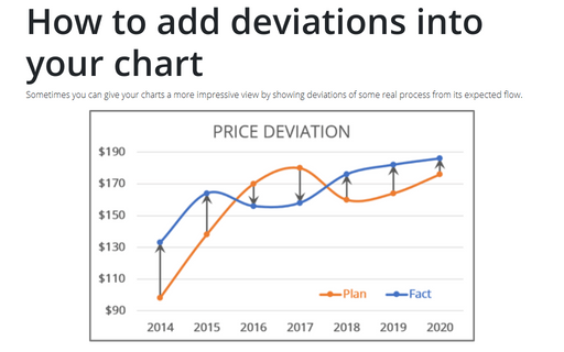
How to add deviations into your chart
Sometimes you can give your charts a more impressive view by showing deviations of some real process from its expected flow.
Side by side comparison bar chart with differences
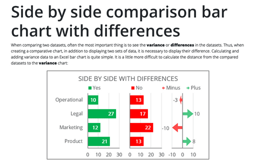
When comparing two datasets, often the most important thing is to see the variance or differences in the datasets. Thus, when creating a comparative chart, in addition to displaying two sets of data, it is necessary to display their difference. Calculating and adding variance data to an Excel bar chart is quite simple. It is a little more difficult to calculate the distance from the compared datasets to the variance chart:
Creating a glossy thermometer chart
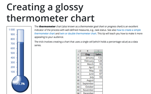
The thermometer chart (also known as a thermometer goal chart or progress chart) is an excellent indicator of the process with well-defined measures, e.g., task status. See also how to create a simple thermometer chart and twin or double thermometer chart. This tip will teach you how to make it more appealing to your audience.
