Creating a rainbow thermometer chart
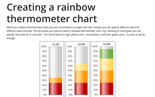
When you create a thermometer chart, you are not limited to a single color bar. Instead, you can specify different colors for different value intervals. This tip shows you how to create a rainbow thermometer chart. E.g., working on some goal, you can specify risk zones for it: red zone - the risk of failure is high, yellow zone - success/fail is unknown, green zone - success is not far enough.
How to draw a pie chart with crayon effect in PowerPoint
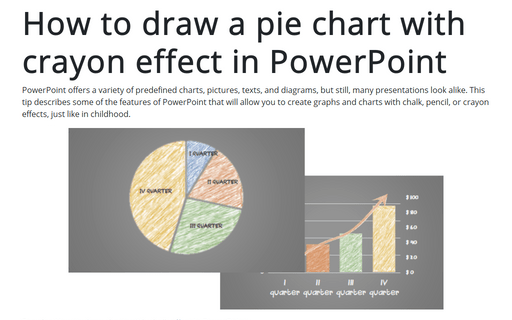
PowerPoint offers a variety of predefined charts, pictures, texts, and diagrams, but still, many presentations look alike. This tip describes some of the features of PowerPoint that will allow you to create graphs and charts with chalk, pencil, or crayon effects, just like in childhood.
How to create a box and whisker plot in Excel
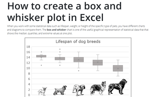
When you work with some statistical data such as lifespan, weight, or height of the specific type of pets, you have different charts and diagrams to compare them. The box and whisker chart is one of the useful graphical representation of statistical data that that shows the median, quartiles, and extreme values at one plot.
Tally chart in Excel
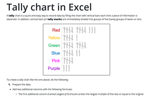
A tally chart is a quick and easy way to record data by filling the chart with vertical bars each time a piece of information is observed. In addition, vertical bars (or tally marks) are immediately divided into groups of five (rarely groups of seven or ten).
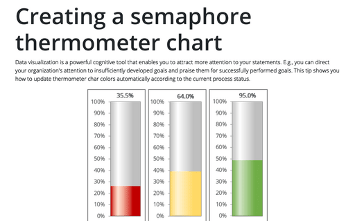
Creating a semaphore thermometer chart
Data visualization is a powerful cognitive tool that enables you to attract more attention to your statements. E.g., you can direct your organization's attention to insufficiently developed goals and praise them for successfully performed goals. This tip shows you how to update thermometer char colors automatically according to the current process status.
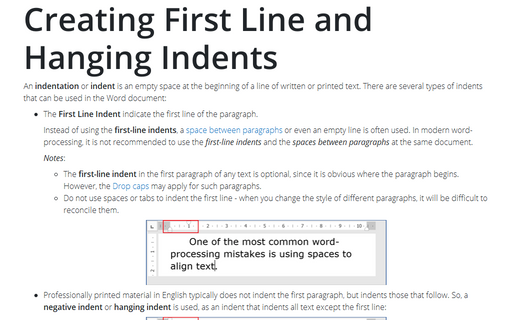
Creating First Line and Hanging Indents
An indentation or indent is an empty space at the beginning of a line of
written or printed text recommended to use instead of spaces or tabs at the beginning of lines. Automatic text indentation makes Word documents formatting consistent and easy to change.
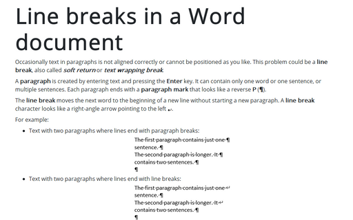
Line breaks in a Word document
Occasionally text in paragraphs is not aligned correctly or cannot be positioned as you like. This problem could be a line break, also called soft return or text wrapping break.
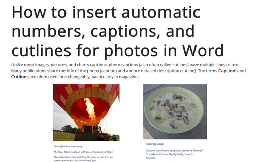
How to insert automatic numbers, captions, and cutlines for photos in Word
Unlike most images, pictures, and charts captions, photo captions (also often called cutlines) have multiple lines of text. Many publications share the title of the photo (caption) and a more detailed description (cutline). The terms Captions and Cutlines are often used interchangeably, particularly in magazines.
Creating a twin or double thermometer chart
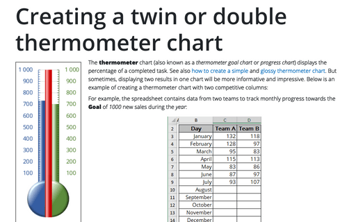
The thermometer chart (also known as a thermometer goal chart or progress chart) displays the percentage of a completed task. See also how to create a simple and glossy thermometer chart. But sometimes, displaying two results in one chart will be more informative and impressive. Below is an example of creating a thermometer chart with two competitive columns:
How to create bar chart of the survey results
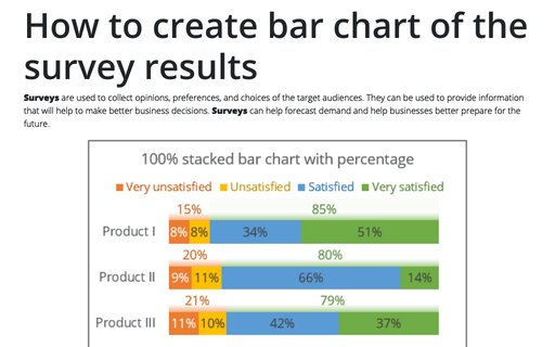
Surveys are used to collect opinions, preferences, and choices of the target audiences. They can be used to provide information that will help to make better business decisions. Surveys can help forecast demand and help businesses better prepare for the future.
