How to create a simple histogram chart in Excel
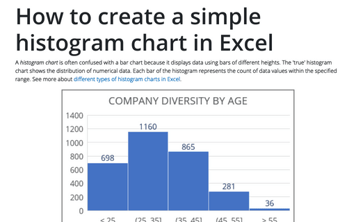
A histogram chart is often confused with a bar chart because it displays data using bars of different heights. The 'true' histogram chart shows the distribution of numerical data. Each bar of the histogram represents the count of data values within the specified range. See more about different types of histogram charts in Excel.
Excel 3-D Pie charts
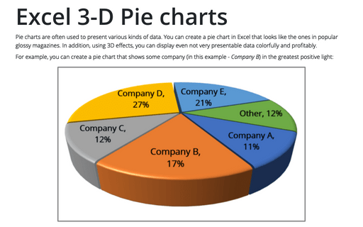
Pie charts are often used to present various kinds of data. You can create a pie chart in Excel that looks like the ones in popular glossy magazines. In addition, using 3D effects, you can display even not very presentable data colorfully and profitably.
Hiding pictures
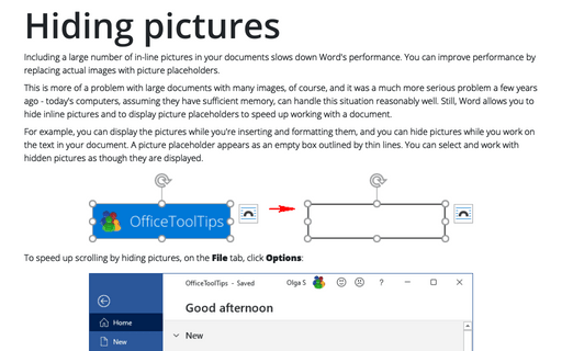
Including a large number of in-line pictures in your documents slows down Word's performance. You can
improve performance by replacing actual images with picture placeholders.
How to use Camera tool in Excel
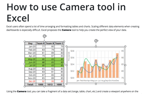
Excel users often spend a lot of time arranging and formatting tables and charts. Scaling different data elements when creating dashboards is especially difficult. Excel proposes the Camera tool to help you create the perfect view of your data.
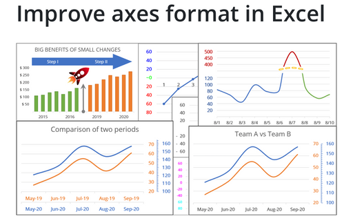
Improve axes format in Excel
Very few Excel users pay attention to the chart axes, but there are some tricks with axes that will help you to improve your visualizations with little or no efforts.
How to create re-sorting chart in Excel
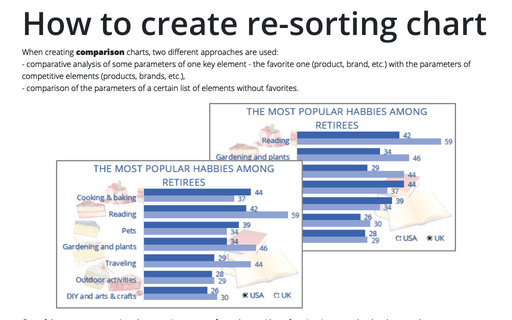
When creating comparison charts, two different approaches are used:
- comparative analysis of some parameters of one key element - the favorite one (product, brand, etc.) with the parameters of competitive elements (products, brands, etc.),
- comparison of the parameters of a certain list of elements without favorites.
- comparative analysis of some parameters of one key element - the favorite one (product, brand, etc.) with the parameters of competitive elements (products, brands, etc.),
- comparison of the parameters of a certain list of elements without favorites.
How to keep two or several words together in a Word document
When you create a Word document, often you need to add some words that should be kept together even if
Word wants to put them on different lines.
How to create a dynamic presentation
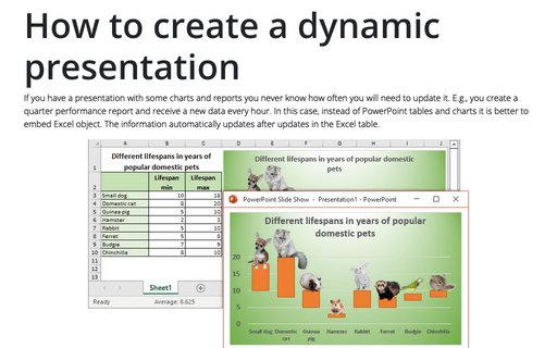
If you have a presentation with some charts and reports you never know how often you will need to update it. E.g., you create a quarter performance report and receive a new data every hour. In this case, instead of PowerPoint tables and charts it is better to embed Excel object. The information automatically updates after updates in the Excel table.
Creating a Candlestick Stock chart with volume
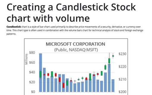
Candlestick chart is a style of bar-chart used primarily to describe price movements of a security, derivative, or currency over time. This chart type is often used in combination with the volume bars chart for technical analysis of stock and foreign exchange patterns.
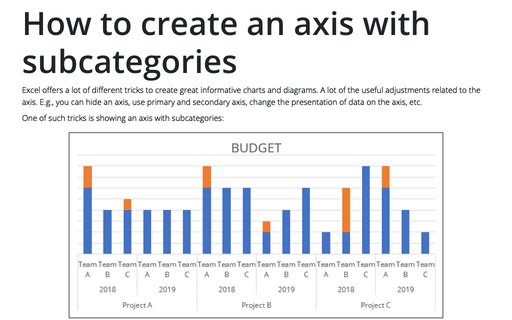
How to create an axis with subcategories
Excel offers a lot of different tricks to create great informative charts and diagrams. A lot of
the useful adjustments related to the axis. E.g., you can hide an axis, use primary and
secondary axis, change the presentation of data on the axis, etc.
