How to make your data changes in the chart more informative
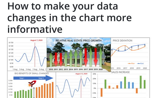
Simple line and bar charts often attract little or no interest in the audience. Still, Excel allows you to attract attention to your data by emphasizing change direction, difference, or period.
How to add Dividers to the chart
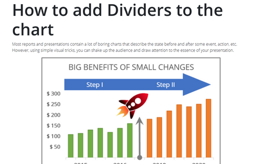
Most reports and presentations contain a lot of boring charts that describe the state before and after some
event, action, etc. However, using simple visual tricks, you can shake up the audience and draw attention
to the essence of your presentation.
How to create a span chart in Excel
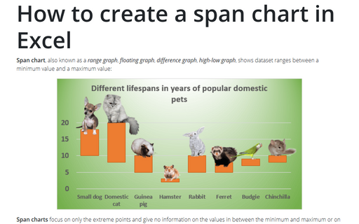
Span chart, also known as a range graph, floating graph, difference graph, high-low graph, shows dataset ranges between a minimum value and a maximum value:
Using Arrows in a Chart
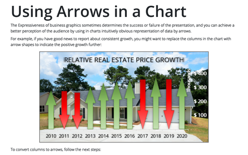
The Expressiveness of business graphics sometimes determines the success or failure of the presentation, and you can achieve a better perception of the audience by using in charts intuitively obvious representation of data by arrows.
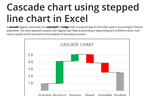
Cascade chart using stepped line chart in Excel
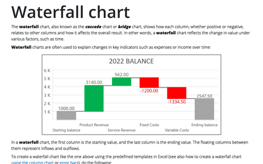
A cascade diagram, also known as a waterfall or bridge chart, is a special type of chart often used in accounting for financial statements. This chart represents positive and negative cash flows as ascending or descending bars of different colors. Each column except the first one starts at the endpoint of the previous column:
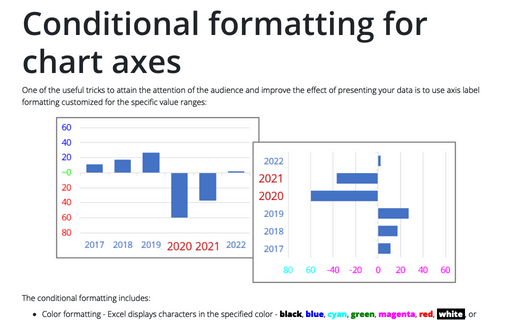
Conditional formatting for chart axes
One of the useful tricks to attain the attention of the audience and improve the effect of presenting your data is to use axis label formatting customized for the specific value ranges:
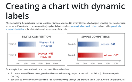
Creating a chart with dynamic labels
Often actualizing the graph data takes a long time. Suppose you need to present frequently changing, updating, or extending data. In that case, it's easier to create automatically updated charts, such as automatically extended charts, charts with dynamically updated chart titles, or labels that depend on the value of the cells:
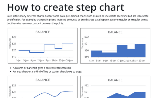
How to create step chart in Excel
Excel offers many different charts, but for some data, pre-defined charts such as area or line charts seem fine but are inaccurate by definition. For example, changes in prices, invested amounts, or any discrete data happen at some regular or irregular points, but the value remains constant between the points:
Waterfall chart
The waterfall chart, also known as the cascade chart or bridge chart, shows how each column, whether positive or negative, relates to other columns and how it affects the overall result. In other words, a waterfall chart reflects the change in value under various factors, such as time.
How to create a comparative histogram chart in Excel
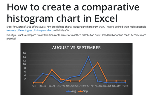
Excel for Microsoft 365 offers several new pre-defined charts, including the histogram chart. This pre-defined chart makes possible to create different types of histogram charts with little effort.
