How to create a perfect Gantt chart
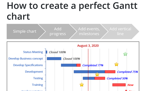
Gantt charts illustrate project schedules and, thus, often used by project managers. Project management tools like Microsoft Project are better suited for Gantt charts, but it is easy to create a Gantt chart in Excel following the simple steps.
How to create a combination chart in PowerPoint
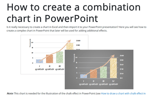
Is it really necessary to create a chart in Excel and then import it to your PowerPoint presentation? Here you will see how to create a complex chart in PowerPoint that later will be used for adding additional effects.
How to customize your local Excel chart settings
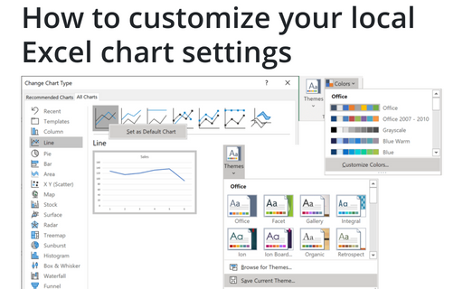
The default installation of Excel has reasonable presets for chart types and colors, but you can change those
defaults according to your own preferences.
How to use progress pie charts for numbering in PowerPoint
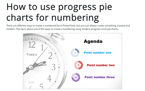
There are different ways to create a numbered list in PowerPoint, but you can always create something creative and modern. This tip is about one of the ways to create a numbering using modern progress circle pie charts.
How to create irregular polygon charts in Excel
Many organizations utilize 360-degree feedback (also known as multi-rater feedback, multi-source feedback, multi-source assessment, or 360-degree review) to assist
employees in work and social skills development. This process includes gathering employee's subordinates, colleagues, supervisor(s), and manager(s) feedback; and comparing self-evaluation and individual group metrics.
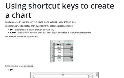
Using shortcut keys to create a chart
Excel proposes an easy and very fast way to create a chart by using shortcut keys.
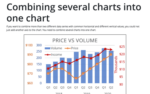
Combining several charts into one chart
If you want to combine more than two different data series with common horizontal and different vertical values, you could not just add another axis to the chart. You need to combine several charts into one chart.
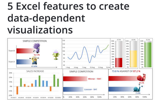
5 Excel features to create data-dependent visualizations
There are several useful features in Excel that can help to create your charts, which automatically change visual appearance depending on data.
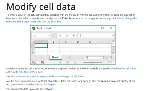
Modify cell data
To enter a value in the cell, activate it by selecting with the mouse or moving the cursor into the cell using the navigation keys, enter the value or type the text, and press the Enter key or one of the navigation arrow keys. See how to change the direction of the cursor after pressing the Enter key.
Creating a gauge chart
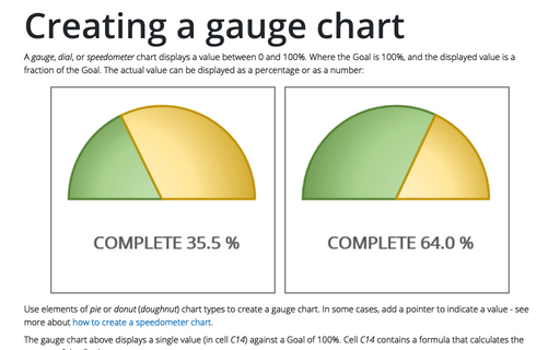
A gauge, dial, or speedometer chart displays a value between 0 and 100%. Where the Goal is 100%, and the displayed value is a fraction of the Goal. The actual value can be displayed as a percentage or as a number:
