Excel 365
6 ways to open an Excel workbook
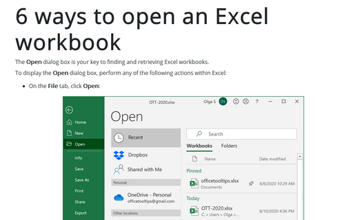
The Open dialog box is your key to finding and retrieving Excel workbooks.
Modify cell data
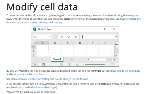
To enter a value in the cell, activate it by selecting with the mouse or moving the cursor into the cell using the navigation keys, enter the value or type the text, and press the Enter key or one of the navigation arrow keys. See how to change the direction of the cursor after pressing the Enter key.
Recalculating the worksheet
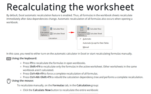
By default, Excel automatic recalculation feature is enabled. Thus, all formulas in the workbook sheets recalculate immediately after data dependencies change. Automatic recalculation of all formulas also occurs when opening a workbook.
How to insert fractions
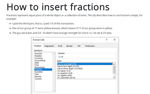
Fractions represent equal parts of a whole object or a collection of items. This tip describes how to use fractions simply. For example:
- I paid the third part, that is, I paid 1/3 of the transaction,
- Five of our group of 17 wore yellow dresses, which means 5/17 of our group were in yellow,
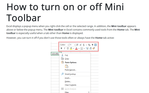
How to turn on or off Mini Toolbar
Excel displays a popup menu when you right-click the cell or the selected range. In addition, the Mini toolbar appears above or below the popup menu. The Mini toolbar in Excel contains commonly used tools from the Home tab. The Mini toolbar is especially useful when a tab other than Home is displayed.
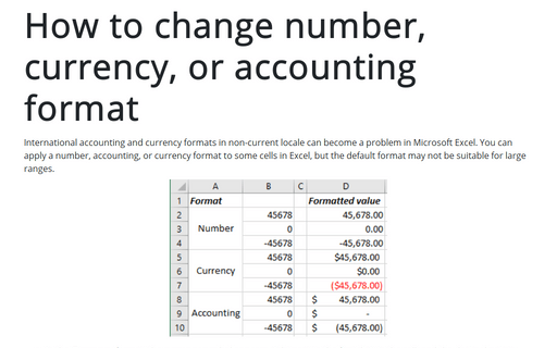
How to change number, currency, or accounting format
International accounting and currency formats in non-current locale can become a problem in Microsoft Excel. You can apply a number, accounting, or currency format to some cells in Excel, but the default format may not be suitable for large ranges.
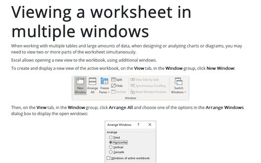
Viewing a worksheet in multiple windows
When working with multiple tables and large amounts of data, when designing or analyzing charts or diagrams, you may need to view two or more parts of the worksheet simultaneously.
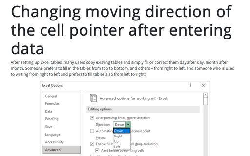
Changing moving direction of the cell pointer after entering data
After setting up Excel tables, many users copy existing tables and simply fill or correct them day after day, month after month. Someone prefers to fill in the tables from top to bottom, and others – from right to left, and someone who is used to writing from right to left and prefers to fill tables also from left to right:
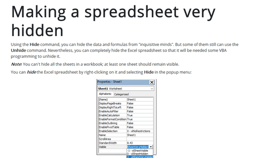
Making a spreadsheet very hidden
Using the Hide command, you can hide the data and formulas from "inquisitive minds." But some of them still can use the Unhide command. Nevertheless, you can completely hide the Excel spreadsheet so that some VBA programming will be needed to unhide it.
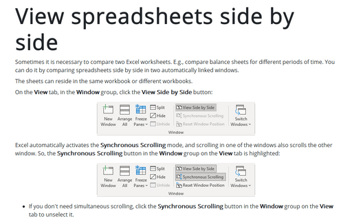
View spreadsheets side by side
Sometimes it is necessary to compare two Excel worksheets. E.g., compare balance sheets for different periods of time. You can do it by comparing spreadsheets side by side in two automatically linked windows.
