The Area chart for Investments
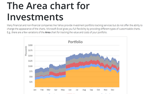
Many financial and non-financial companies like Yahoo provide investment portfolio tracking services
but do not offer the ability to change the appearance of the charts. Microsoft Excel gives you full
flexibility by providing different types of customizable charts. E.g., there are a few variations of
the Area chart for tracking the value and costs of your portfolio.
Creating a semaphore thermometer chart
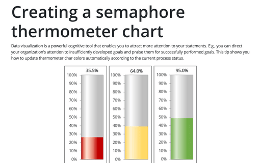
Data visualization is a powerful cognitive tool that enables you to attract more attention to your statements. E.g., you can direct your organization's attention to insufficiently developed goals and praise them for successfully performed goals. This tip shows you how to update thermometer char colors automatically according to the current process status.
How to show Likert scale chart (integrated neutral)
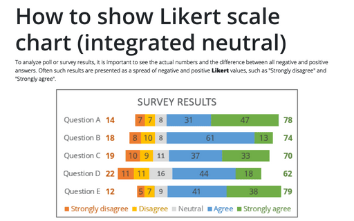
To analyze poll or survey results, it is important to see the actual numbers and the difference between all negative and positive answers. Often such results are presented as a spread of negative and positive Likert values, such as "Strongly disagree" and "Strongly agree".
How to show Likert scale chart with extra neutral
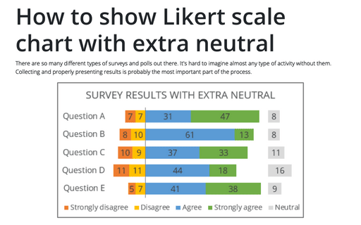
There are so many different types of surveys and polls out there. It's hard to imagine almost any type of activity without them. Collecting and properly presenting results is probably the most important part of the process.
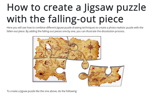
How to create a Jigsaw puzzle with the falling-out piece
Here you will see how to combine different Jigsaw puzzle drawing techniques to create a photo-realistic puzzle with the fallen-out piece. By adding the falling-out pieces one by one, you can illustrate the dissolution process.
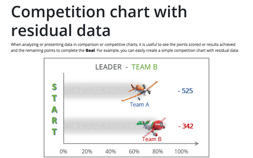
Competition chart with residual data
When analyzing or presenting data in comparison or competitive charts, it is useful to see the points scored or results achieved and the remaining points to complete the Goal. For example, you can easily create a simple competition chart with residual data:
How to add pictures to vertical axis of the bar chart
Nowadays, icons, logos, and abbreviations often carry more information than the textual names of companies, brands, applications, games, etc. To create memorable charts and faster understanding and recognition of information, instead of the names of countries, brands, etc., you can substitute the corresponding pictures on the axis of the charts.
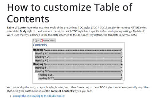
How to customize Table of Contents
Table of Contents entries use nine levels of the pre-defined TOC styles (TOC 1, TOC 2, etc.) for formatting. All TOC styles extend the Body style of the document theme, but each TOC style has a specific indent and spacing settings. By default, Word uses the styles defined in the template attached to the document (by default, the template is normal.dotx):
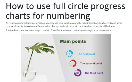
How to use full circle progress charts for numbering
To create an unforgettable presentation, you may use your own funny or otherwise interesting visual accents and some creative elements. You can use different colors, backgrounds, pictures, etc., but standard elements still limit you.
How to hide the cell values in Excel without hiding cells
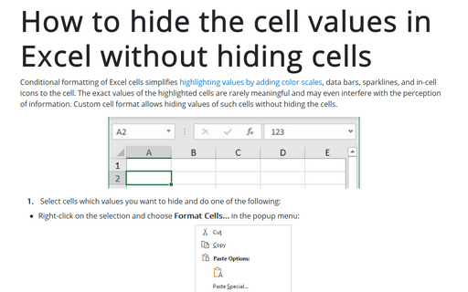
Conditional formatting of Excel cells simplifies highlighting values by adding color scales, data bars, sparklines, and in-cell icons to the cell. The exact values of the highlighted cells are rarely meaningful and may even interfere with the perception of information. Custom cell format allows hiding values of such cells without hiding the cells.
