How to insert fractions
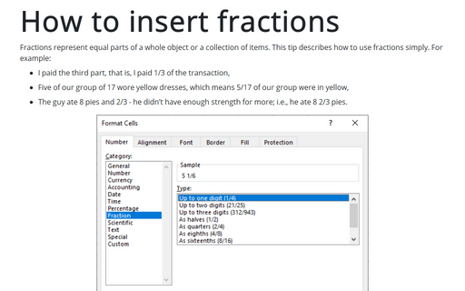
Fractions represent equal parts of a whole object or a collection of items. This tip describes how to use fractions simply. For example:
- I paid the third part, that is, I paid 1/3 of the transaction,
- Five of our group of 17 wore yellow dresses, which means 5/17 of our group were in yellow,
How to create a funny dog breeds lifespan chart in Excel
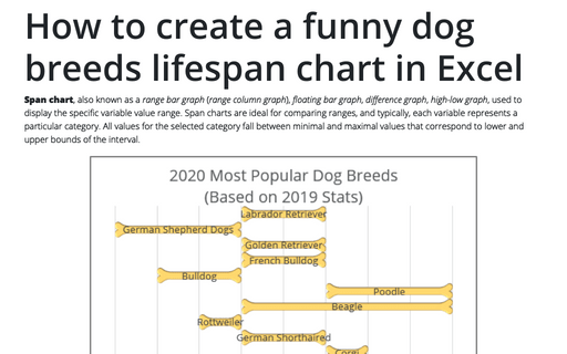
Span chart, also known as a range bar graph (range column graph), floating bar graph, difference graph, high-low graph, used to display the specific variable value range. Span charts are ideal for comparing ranges, and typically, each variable represents a particular category. All values for the selected category fall between minimal and maximal values that correspond to lower and upper bounds of the interval.
How to create a step Area chart for the Mosaic plot in Excel
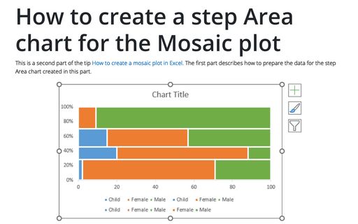
This is a second part of the tip How to create a Mosaic plot in Excel. The first part describes how to prepare the data for the step Area chart created in this part.
How to create Master and Scrolled Detail charts
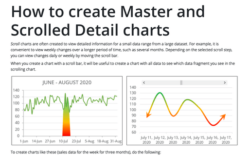
Scroll charts are often created to view detailed information for a small data range from a large dataset. For example, it is convenient to view weekly changes over a longer period of time, such as several months. Depending on the selected scroll step, you can view changes daily or weekly by moving the scroll bar.
Side by side comparison bar chart with differences
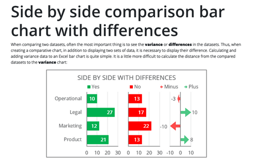
When comparing two datasets, often the most important thing is to see the variance or differences in the datasets. Thus, when creating a comparative chart, in addition to displaying two sets of data, it is necessary to display their difference. Calculating and adding variance data to an Excel bar chart is quite simple. It is a little more difficult to calculate the distance from the compared datasets to the variance chart:
Highlight data series in line chart
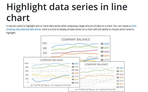
It may be useful to highlight one or more data series when analyzing a large amount of data on a chart. You can create a chart showing only selected data series. Here is a trick to display all data series on a chart with the ability to choose which ones to highlight:
Creating First Line and Hanging Indents
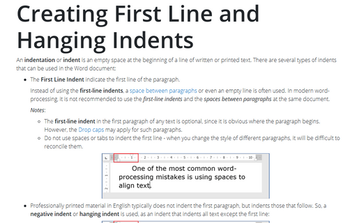
An indentation or indent is an empty space at the beginning of a line of
written or printed text recommended to use instead of spaces or tabs at the beginning of lines. Automatic text indentation makes Word documents formatting consistent and easy to change.
Line breaks in a Word document
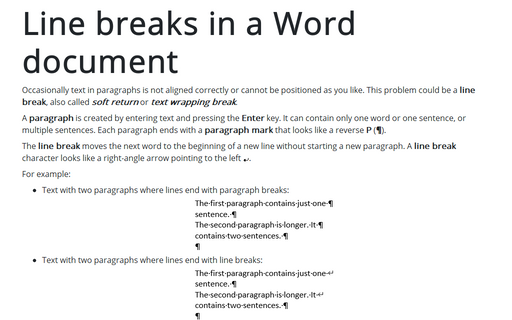
Occasionally text in paragraphs is not aligned correctly or cannot be positioned as you like. This problem could be a line break, also called soft return or text wrapping break.
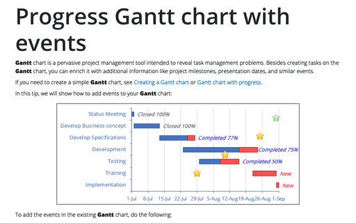
Progress Gantt chart with events
Gantt chart is a pervasive project management tool intended to reveal task management problems. Besides creating tasks on the Gantt chart, you can enrich it with additional information like project milestones, presentation dates, and similar events.
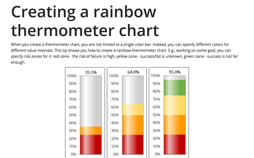
Creating a rainbow thermometer chart
When you create a thermometer chart, you are not limited to a single color bar. Instead, you can specify different colors for different value intervals. This tip shows you how to create a rainbow thermometer chart. E.g., working on some goal, you can specify risk zones for it: red zone - the risk of failure is high, yellow zone - success/fail is unknown, green zone - success is not far enough.
