Fill and outline options in Microsoft
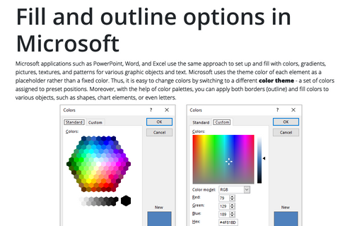
Microsoft applications such as PowerPoint, Word, and Excel use the same approach to set up and fill with colors, gradients, pictures, textures, and patterns for various graphic objects and text. Microsoft uses the theme color of each element as a placeholder rather than a fixed color. Thus, it is easy to change colors by switching to a different color theme - a set of colors assigned to preset positions.
How to insert automatic numbers, captions, and cutlines for photos in Word
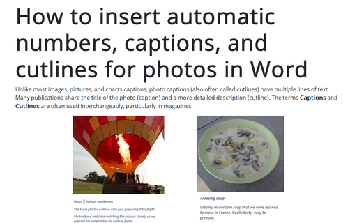
Unlike most images, pictures, and charts captions, photo captions (also often called cutlines) have multiple lines of text. Many publications share the title of the photo (caption) and a more detailed description (cutline). The terms Captions and Cutlines are often used interchangeably, particularly in magazines.
How to lock objects from moving and resizing in PowerPoint
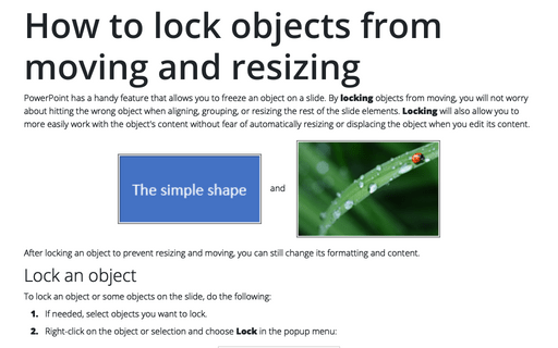
PowerPoint has a handy feature that allows you to freeze an object on a slide. By locking objects from moving, you will not worry about hitting the wrong object when aligning, grouping, or resizing the rest of the slide elements. Locking will also allow you to more easily work with the object's content without fear of automatically resizing or displacing the object when you edit its content.
Polynomial trend equation and forecast
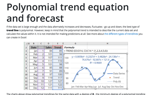
If the data set is large enough and the data alternately increases and decreases, fluctuates - go up and down, the best type of trend line is polynomial. However, keep in mind that the polynomial trend is intended to describe the current data set and calculate the values within it. It is not intended for making predictions at all. See more about the different types of trendlines you can create in Excel:
Power trend equation and forecast
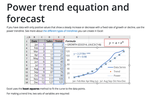
If you have data with only positive values that show a steady increase or decrease with a fixed rate of growth or decline, use the power trendline. See more about the different types of trendlines you can create in Excel:
Exponential trend equation and forecast
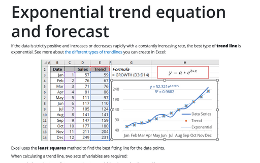
If the data is strictly positive and increases or decreases rapidly with a constantly increasing rate, the best type of trend line is exponential. See more about the different types of trendlines you can create in Excel:
How to change the default colors that Excel uses for chart series
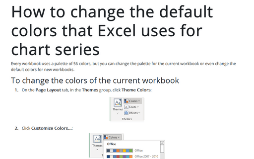
Every workbook uses a palette of 56 colors, but you can change the palette for the current workbook or even change the default colors for new workbooks.
Turn off or on automatically opening of Design Ideas pane
The new PowerPoint Designer feature automatically generates design ideas on the new Design Ideas pane. By default, this pane appears on the right side of the slide and can be very useful for creative users:
How to stress cyclic processes using two arrow circle diagram
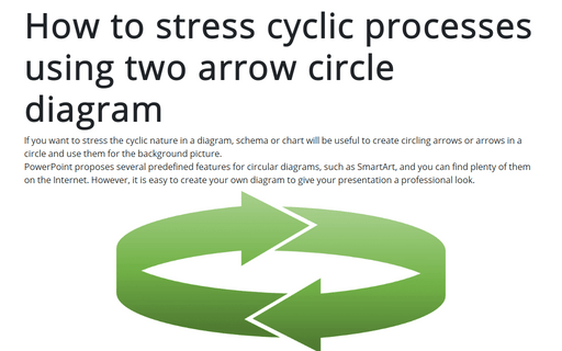
If you want to stress the cyclic nature in a diagram, schema or chart will be useful to create circling arrows or arrows in a circle and use them for the background picture.
PowerPoint proposes several predefined features for circular diagrams, such as SmartArt, and you can find plenty of them on the Internet. However, it is easy to create your own diagram to give your presentation a professional look.
PowerPoint proposes several predefined features for circular diagrams, such as SmartArt, and you can find plenty of them on the Internet. However, it is easy to create your own diagram to give your presentation a professional look.
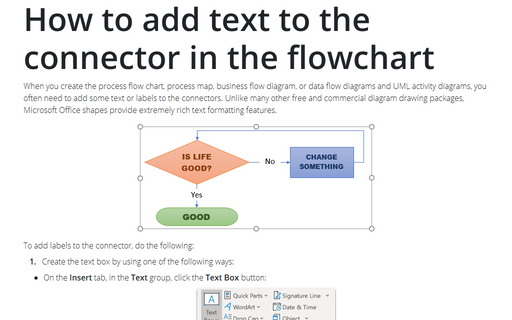
How to add text to the connector in the flowchart
When you create the process flow chart, process map, business flow diagram, or data flow diagrams and UML
activity diagrams, you often need to add some text or labels to the connectors. Unlike many other free and
commercial diagram drawing packages, Microsoft Office shapes provide extremely rich text formatting
features.
