Using Pie Charts and Doughnut Charts in Excel
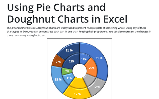
The pie and donut (in Excel, doughnut) charts are widely used to present multiple parts of something whole. Using any of these chart types in Excel, you can demonstrate each part in one chart keeping their proportions. You can also represent the changes in those parts using a doughnut chart:
Creating a chart with dynamic labels
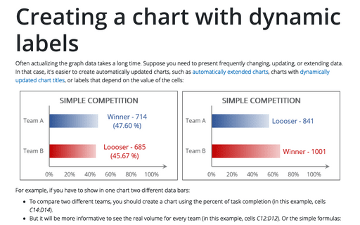
Often actualizing the graph data takes a long time. Suppose you need to present frequently changing, updating, or extending data. In that case, it's easier to create automatically updated charts, such as automatically extended charts, charts with dynamically updated chart titles, or labels that depend on the value of the cells:
How to create a histogram chart by categories in Excel
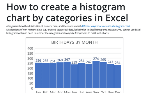
Histograms show the distribution of numeric data, and there are several different ways how to create a histogram chart. Distributions of non-numeric data, e.g., ordered categorical data, look similar to
Excel histograms. However, you cannot use Excel histogram tools and need to reorder the categories and compute frequencies to build such charts.
How to create a Mosaic plot in Excel
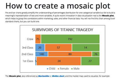
Pie and bar charts greatly simplify the understanding of percentages distribution for one categorical variable but fail to build a meaningful representation of two and more variables. A quite recent innovation in data visualization real is the Mosaic plot, which helps to grasp the correlations within marketing, sales, and other financial data. You will not find this chart among Excel standard charts, but you can build one.
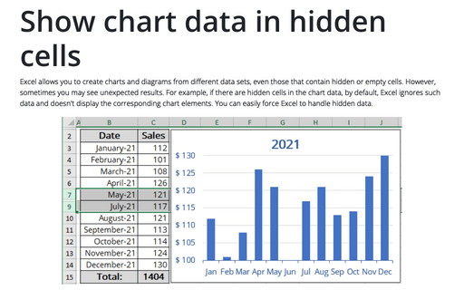
Show chart data in hidden cells
Excel allows you to create charts and diagrams from different data sets, even those that contain hidden or empty cells. However, sometimes you may see unexpected results. For example, if there are hidden cells in the chart data, by default, Excel ignores such data and doesn't display the corresponding chart elements. You can easily force Excel to handle hidden data.
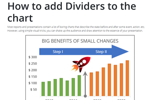
How to add Dividers to the chart
Most reports and presentations contain a lot of boring charts that describe the state before and after some
event, action, etc. However, using simple visual tricks, you can shake up the audience and draw attention
to the essence of your presentation.
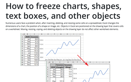
How to freeze charts, shapes, text boxes, and other objects in Excel
Numerous users face a problem when, after inserting, deleting, and resizing some cells on a spreadsheet, Excel changes the dimensions of a chart, the position of a shape or image, etc. Objects in Excel are positioned on the drawing layer that covers cells on a worksheet.
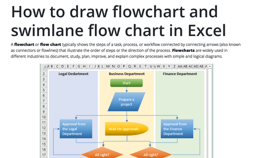
How to draw flowchart and swimlane flow chart in Excel
A flowchart or flow chart typically shows the steps of a task, process, or workflow connected
by connecting arrows (also known as connectors or flowlines) that illustrate the order of steps or the
direction of the process. Flowcharts are widely used in different industries to document, study,
plan, improve, and explain complex processes with simple and logical diagrams.
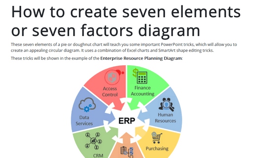
How to create seven elements graph or seven factors diagram
These seven elements of a pie or doughnut chart will teach you some important PowerPoint tricks, which will allow you to create an appealing circular diagram. It uses a combination of Excel charts and SmartArt shape editing tricks.
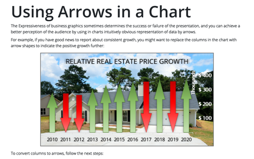
Using Arrows in a Chart
The Expressiveness of business graphics sometimes determines the success or failure of the presentation, and you can achieve a better perception of the audience by using in charts intuitively obvious representation of data by arrows.
