How to make Mirror chart in Excel
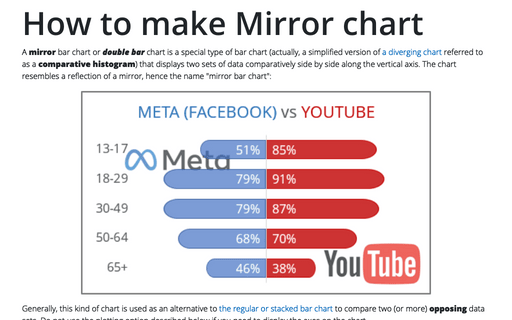
A mirror bar chart or double bar chart is a special type of bar chart (actually, a simplified version of a diverging chart referred to as a comparative histogram) that displays two sets of data comparatively side by side along the vertical axis. The chart resembles a reflection of a mirror, hence the name "mirror bar chart":
Linear trend equation and forecast
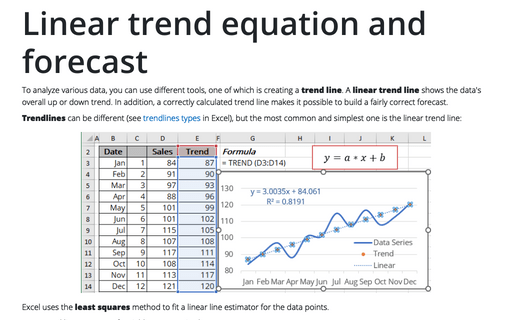
To analyze various data, you can use different tools, one of which is creating a trend line. A linear trend line shows the data's overall up or down trend. In addition, a correctly calculated trend line makes it possible to build a fairly correct forecast.
How to create interactive chart with dropdown list in Excel
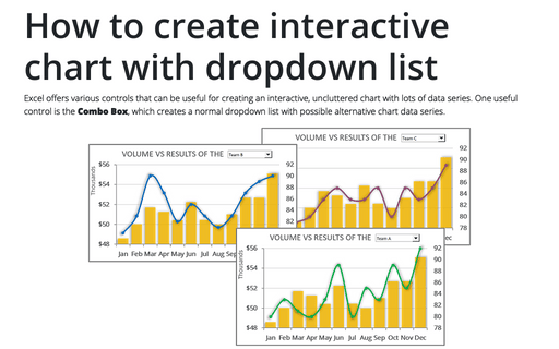
Excel offers various controls that can be useful for creating an interactive, uncluttered chart with lots of data series. One useful control is the Combo Box, which creates a normal dropdown list with possible alternative chart data series.
How to add and remove horizontal lines between sections of the document
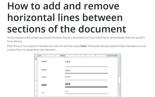
Word proposes a very simple way to add horizontal lines to a document, but if you would like to remove these
lines, this wouldn't be so obvious.
Side by side comparison bar chart with the same axes
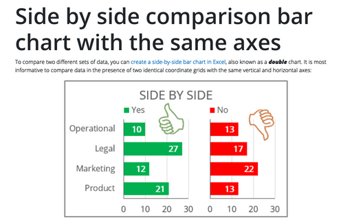
To compare two different sets of data, you can create a side-by-side bar chart in Excel, also known as a double chart. It is most informative to compare data in the presence of two identical coordinate grids with the same vertical and horizontal axes:
Polynomial trend equation and forecast
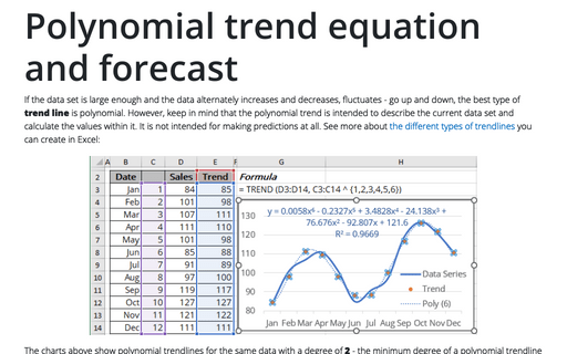
If the data set is large enough and the data alternately increases and decreases, fluctuates - go up and down, the best type of trend line is polynomial. However, keep in mind that the polynomial trend is intended to describe the current data set and calculate the values within it. It is not intended for making predictions at all. See more about the different types of trendlines you can create in Excel:
Exponential trend equation and forecast
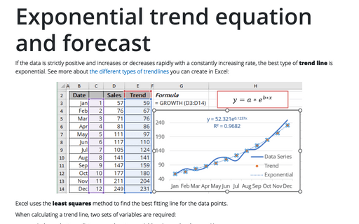
If the data is strictly positive and increases or decreases rapidly with a constantly increasing rate, the best type of trend line is exponential. See more about the different types of trendlines you can create in Excel:
How to add labels to the Marimekko chart
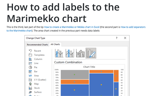
This is the third, last part of the tip How to create a Marimekko or Mekko chart in Excel (the second part is How to add separators to the Marimekko chart). The area chart created in the previous part needs data labels:
How to create a timeline in PowerPoint
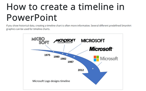
If you show historical data, creating a timeline chart is often more informative. Several different predefined SmartArt graphics can be used for timeline charts.
This tip shows simple steps for creating a simple and informative timeline using Microsoft logo design changes (see https://en.wikipedia.org/wiki/Microsoft#Logo).
This tip shows simple steps for creating a simple and informative timeline using Microsoft logo design changes (see https://en.wikipedia.org/wiki/Microsoft#Logo).
How to add labels to the Mosaic plot
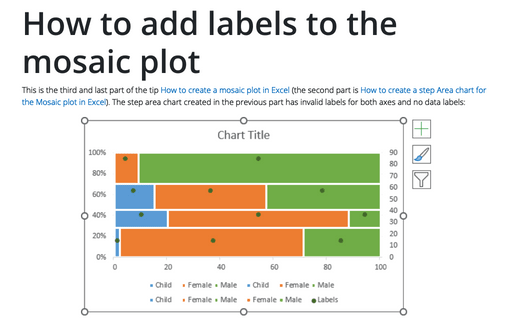
This is the third and last part of the tip How to create a Mosaic plot in Excel (the second part is How to create a step Area chart for the Mosaic plot in Excel). The step area chart created in the previous part has invalid labels for both axes and no data labels:
