Conditional formatting for chart axes
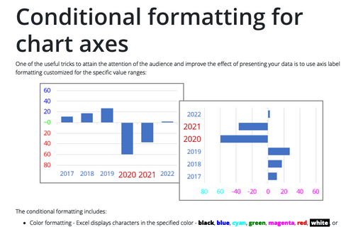
One of the useful tricks to attain the attention of the audience and improve the effect of presenting your data is to use axis label formatting customized for the specific value ranges:
Creating a chart with critical zones
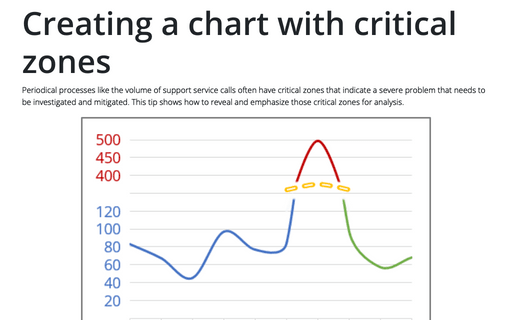
Periodical processes like the volume of support service calls often have critical zones that indicate a severe problem that needs to be investigated and mitigated. This tip shows how to reveal and emphasize those critical zones for analysis.
How to use Camera tool in Excel
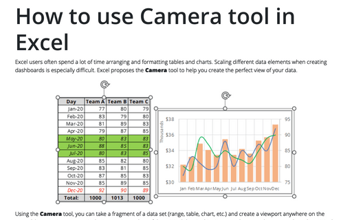
Excel users often spend a lot of time arranging and formatting tables and charts. Scaling different data elements when creating dashboards is especially difficult. Excel proposes the Camera tool to help you create the perfect view of your data.
Creating a simple competition chart
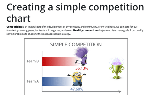
Competition is an integral part of the development of any company and community. From childhood, we compete for our favorite toys among peers, for leadership in games, and so on. Healthy competition helps to achieve many goals: from quickly solving problems to choosing the most appropriate strategy.
Adding error bars
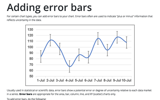
For certain chart types, you can add error bars to your chart. Error bars often are used to indicate "plus or minus" information that reflects uncertainty in the data.
How to create a box and whisker plot in Excel
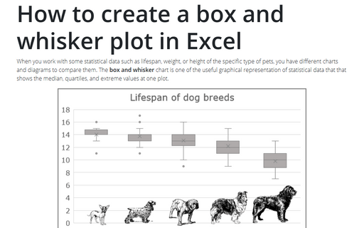
When you work with some statistical data such as lifespan, weight, or height of the specific type of pets, you have different charts and diagrams to compare them. The box and whisker chart is one of the useful graphical representation of statistical data that that shows the median, quartiles, and extreme values at one plot.
Improve axes format in Excel
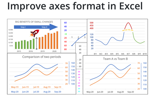
Very few Excel users pay attention to the chart axes, but there are some tricks with axes that will help you to improve your visualizations with little or no efforts.
How to draw a chart with chalk effect in PowerPoint
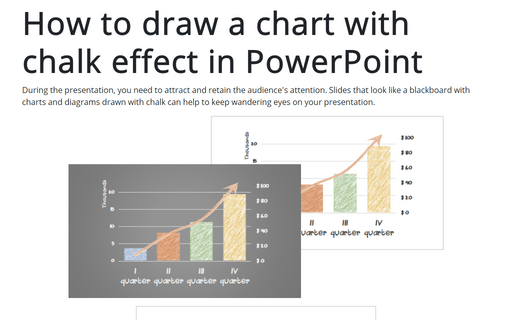
During the presentation, you need to attract and retain the audience's attention. Slides that look like
a blackboard with charts and diagrams drawn with chalk can help to keep wandering eyes on your
presentation.
How to create re-sorting chart in Excel
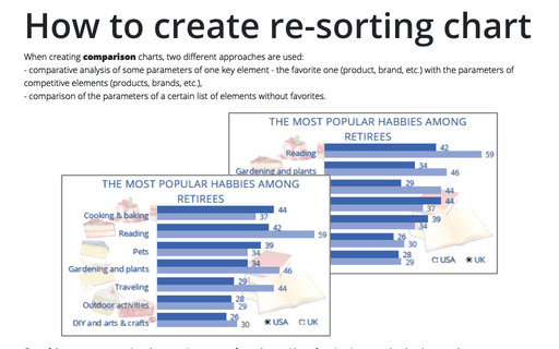
When creating comparison charts, two different approaches are used:
- comparative analysis of some parameters of one key element - the favorite one (product, brand, etc.) with the parameters of competitive elements (products, brands, etc.),
- comparison of the parameters of a certain list of elements without favorites.
- comparative analysis of some parameters of one key element - the favorite one (product, brand, etc.) with the parameters of competitive elements (products, brands, etc.),
- comparison of the parameters of a certain list of elements without favorites.
Format trendlines and Moving Average
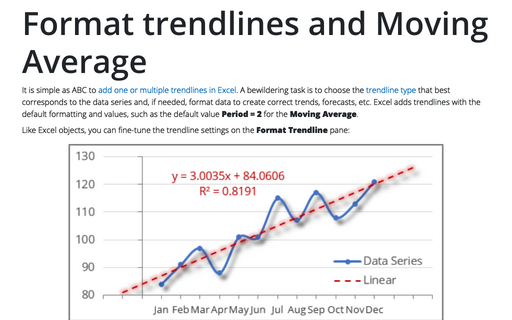
It is simple as ABC to add one or multiple trendlines in Excel. A bewildering task is to choose the trendline type that best corresponds to the data series and, if needed, format data to create correct trends, forecasts, etc. Excel adds trendlines with the default formatting and values, such as the default value Period = 2 for the Moving Average.
