How to use progress pie charts for numbering in PowerPoint
See also the numbering list.

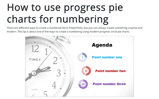
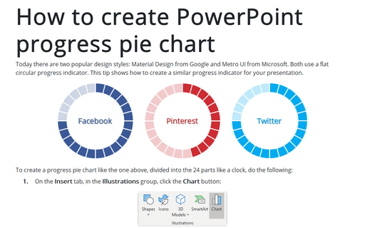
To create a numbered list like the one above, do the following:
1. Create several progress pie charts for every list item:
1.1. On the Insert tab, in the Illustrations group, click the Chart button and then choose the Doughnut chart.
1.2. In the Chart in Microsoft PowerPoint dialog box, enter the data:
- Volume = INT (point number * (pie chart parts) / (total number of
items in the list
+ 1))
Note: the INT formula is used for cases when the number of items can't be divided into the pie chart parts, e.g., 4 items, in that example you will see:
1 * 24 / (4 + 1) = 4.8, using the formula INT, the answer will be rounded to 5.For this example:
- First point = 1 * 24 / (3 + 1) = 6:
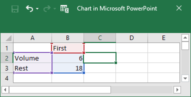
- Second point = 2 * 24 / (3 + 1) = 12;
- Third point = 3 * 24 / (3 + 1) = 18;
- First point = 1 * 24 / (3 + 1) = 6:
- Rest = 100 / (number of parts) – Volume:

2. Choose colors for the pie charts, for example:

3. Change the width of the pie chart:
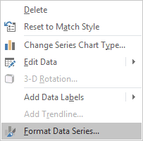
3.1. Right-click on your chart data and select Format Data Series... in the popup menu:
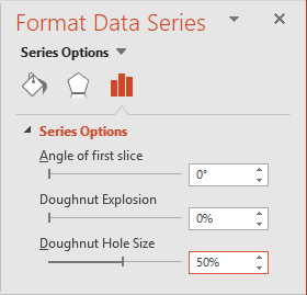
3.2. In the Format Data Series pane, on the Series Options tab, choose the volumes of the Doughnut Hole Size field:
4. Add the new pie chart for borders:
4.1. On the Insert tab, in the Illustrations group, click the Chart button and then choose the Doughnut chart.
4.2. In the Chart in Microsoft PowerPoint dialog box, enter the data stream for 24 parts (or another number you used in the formulas):

4.3. Under Chart Tools, on the Design tab, in the Data group, click on the Select Data button:

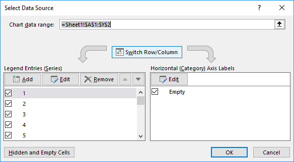
4.4. On the Select Data Source dialog box, click on the Switch Row/Column button:
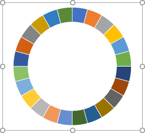
The new pie chart should look like:
4.5. Right-click on your chart data and choose Format Data Series... in the popup menu:

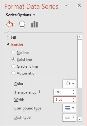
4.6. In the Format Data Series pane, on the Fill & Line tab:
- In the Fill section, choose No fill:
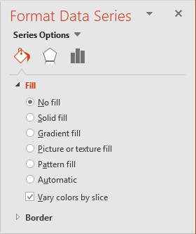
- In the Border section, choose Solid fill, select white color, and increase the width in the
Width field:
4.7. Format chart area, plot area to create an unfilled area without borders – on the Fill & Line tab (see progress pie charts for more details):
- In the Fill section, choose No fill.
- In the Border section, choose No line.
4.8. Change the width for the new chart like in the p. 3.
5. Positioning the charts to show parts:

Make any other adjustments to get the look you desire.
See also this tip in French: Comment utiliser les diagrammes à secteurs de progression pour la numérotation dans PowerPoint.
