Using Pie Charts and Doughnut Charts in Excel
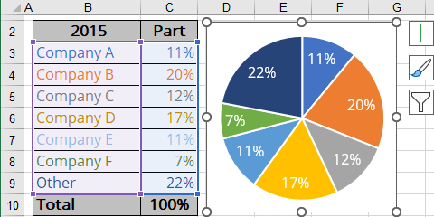
For example:
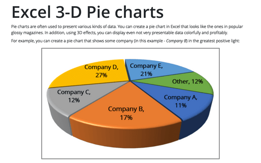
- If you have several companies that operate in the same industry, you can represent a portion of each company in that industry:
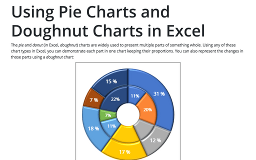
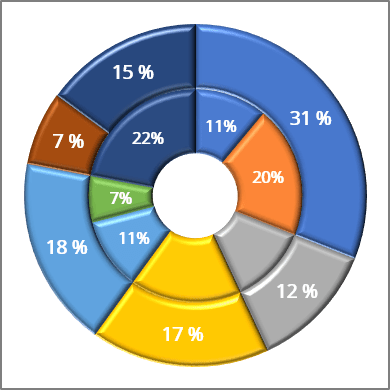
- After the mergers and acquisitions, some companies have taken over other parts:
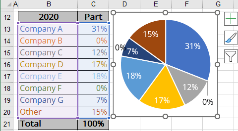
To create one chart of this data, follow these steps:
Create a simple donut chart
1. Select the first data range (in this example, B3:C9).
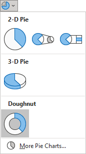
2. On the Insert tab, in the Charts group, click the Insert Pie or Doughnut Chart button:

From the Insert Pie or Doughnut Chart dropdown list, choose the Doughnut chart:
Add the second data series
3. Select the chart and do one of the following:
- On the Chart Design tab, in the Data group, choose Select Data:

- Right-click on the chart data series and choose Select Data... in the popup menu:
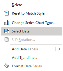
4. In the Select Data Source dialog box, under Legend Entries (Series), click the Add button:
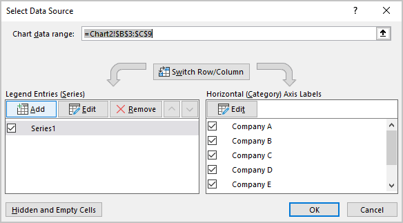
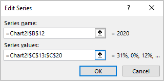
5. In the Edit Series dialog box, select the second data range (in this example, C13:C20):
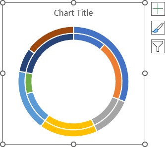
After adding the new data series, the doughnut chart might look like this:
Add the data labels
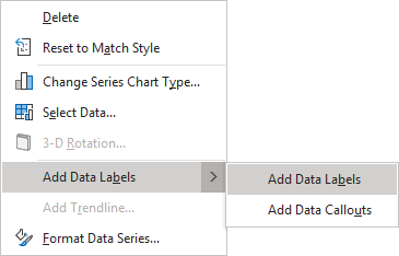
6. To add the data labels, right-click on the data series and choose Add Data Labels -> Add Data Labels in the popup menu:
Format data series
Make data series thinker
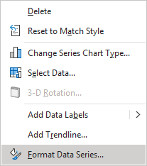
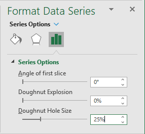
7. To make the data series (or rings of the donut chart) thicker, right-click on any data series and choose Format Data Series... in the popup menu:
On the Format Data Series pane, in the Series Options group, in the Series Options section, type or choose the appropriate value in the Doughnut Hole Size field.
In this example, 25%:
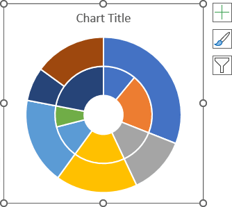
The chart will look more presentable:
Apply 3D effects
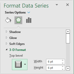
8. To add the 3D effect to the chart parts, on the Format Data Series pane (see step 7 how to open it), in the Effects group, in the 3-D Format section:
- In the Top bevel list, select the preferred bevel type,
- Optionally, type or select the values you need in the Width and Height fields.
For this example:
You can then make any other adjustments to get the look you desire.
See also this tip in French: Utiliser le graphique en secteurs ou en anneau dans Excel.
