How to make your data changes in the chart more informative
1. Focus on the data changes between points
The expressiveness of business graphics sometimes determines the success or failure of the presentation, and you can achieve a better perception of the audience by using in charts intuitively obvious representation of data by arrows:

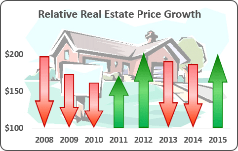
See Using Arrows in a Chart in Excel 365 for more details.
2. Focus on the degree of data changes
To emphasize differences between data in the chart it will be interesting to create a column chart in which the color of each column depends on the value displayed:
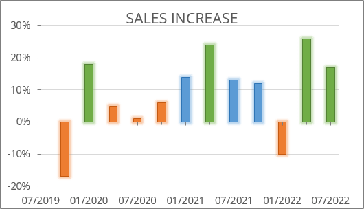
See Displaying conditional colors in a column chart for more details.
3. Show the difference between two data rows
Sometimes you can give your charts more impressive view by showing deviations of some real process from its expected flow:
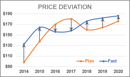
See How to add deviations into your chart for more details.
4. Show the difference between different periods
Most reports and presentations contain a lot of boring charts that describe the state before and after some event, action, etc. However, using simple visual tricks, you can shake up the audience and draw attention to the essence of your presentation:
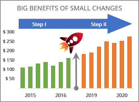
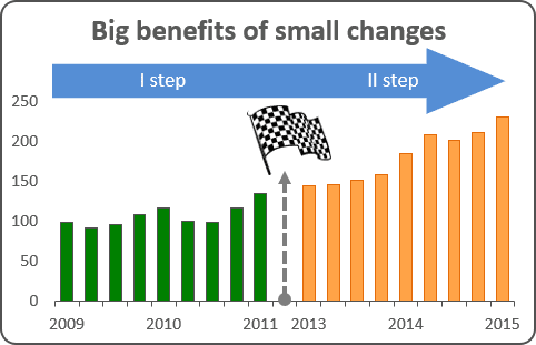
See How to add Dividers to the chart for more details.
5. Emphasize the difference before and after the specified date
You can add a vertical line in your chart to show data and highlight, for example, the current date:
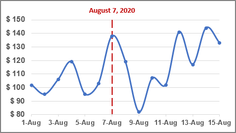
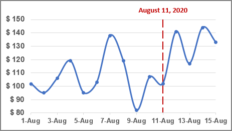
See How to add a vertical line to the chart for more details.
See also this tip in French: Comment rendre vos modifications des données dans le graphique plus informatif.
