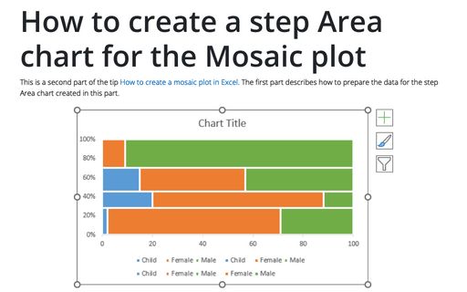
How to create a step Area chart for the Mosaic plot in Excel
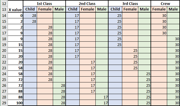
To create the step Area chart, do the following:
1. Create a simple, non-formatted area chart:
1.1. Select a data range (in this example, B13:L29).
1.2. On the Insert tab, in the Charts group, click on the Line dropdown list:

From the Line dropdown list, select the 100% Stacked Area
 chart.
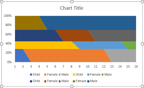
At first glance, Excel creates a little strange area chart for this data, but don't worry (it will become normal after a few customizations):
2. Customize the horizontal (category) axis:
2.1. Do one of the following:
- Under Chart Tools, on the Design tab, in the Data group, choose Select Data:

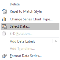
- Right-click in the chart area and choose Select Data... in the popup menu:
2.2. In the Select Data Source dialog box, under Horizontal (Category) Axis Labels, click the Edit button:
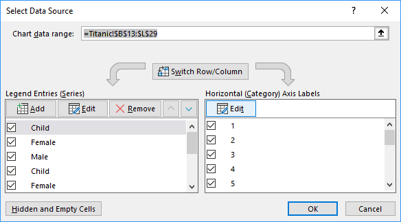
2.3. In the Axis Labels dialog box, choose cells with categories (X values) for this axis and click OK several times:
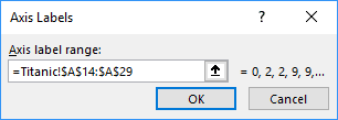
2.4. Right-click on the horizontal axis and choose Format Axis... in the popup menu:
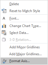
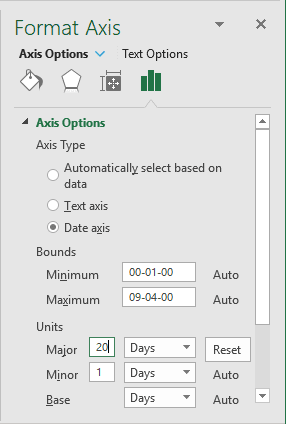
2.5. On the Format Axis pane, on the Axis Options tab, in the Axis Options section:
- Under Axis Type, select the Date axis radio button,
- Under Bounds, be sure that:
- In the Minimum field, the value is the 1st day in Excel:
- 00-01-00, if you use the date format mm-dd-yy,
- 01-00-00, if you use the date format dd-mm-yy,
- In the Maximum field, the value of the 100th day in Excel
(the 4th of September):
- 09-04-00, if you use the date format mm-dd-yy,
- 04-09-00, if you use the date format dd-mm-yy,
Note: Unfortunately, at the moment, there are no other ways in Excel to set the calculated axis from 0 to 100. Thus, this workaround means that you use the calculated amount from 0 to 100 (from the 0 to the 100th day because Excel treats dates as numbers).
- In the Minimum field, the value is the 1st day in Excel:
- Under Units, type 20 days for the Major units:
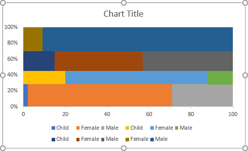
Excel changes the original chart to the following step area chart:
3. Customize the data series:
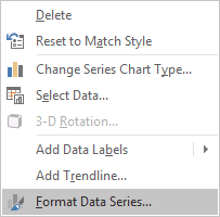
3.1. Right-click on the data series and choose Format Data Series... in the popup menu:
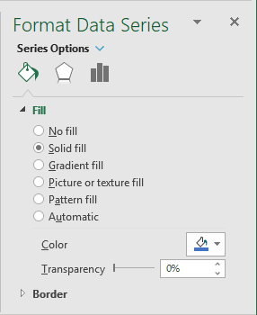
3.2. On the Format Data Series pane, on the Fill & Line tab:
- In the Fill section, select the Solid fill option and choose the
color you prefer:
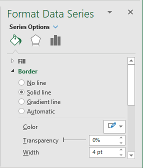
- In the Border section, select the Solid line radio button and choose the
color and width in the appropriate fields:
3.3. Repeat the previous steps of this section to match data series visual appearance:
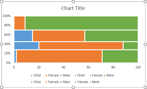
To fix the labels of the chart, see the third part of this tip How to add labels to the mosaic plot in Excel.
