How to create a span chart in Excel

Span charts focus on only the extreme points and give no information on the values in between the minimum and maximum or on averages or the data distribution. To show more details, including minimum and maximum, use the box charts.
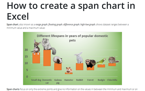
In this example, the chart demonstrates the difference of lifespans of popular domestic pets:
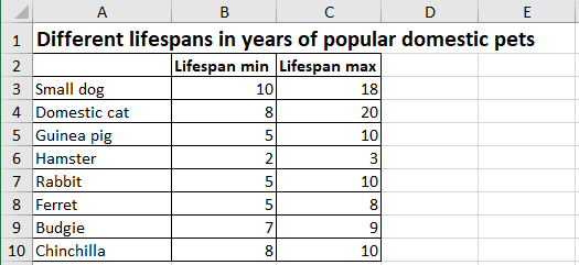
To create a span chart, do the following:
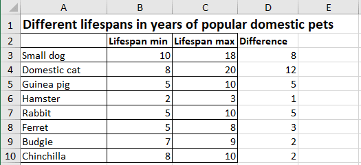
1. Add the new column to the data with the difference between maximum and minimum values:
= Lifespan max – Lifespan min:
2. Create a span chart:
2.1. Select the data for the plot (in this example, A3:B10, D3:D10).
Note: You can choose several discontinuous ranges by holding Ctrl and selecting them.
2.2. On the Insert tab, in the Charts group, click the Insert Bar or Column Chart button:

From the Insert Bar or Column Chart dropdown list, select the Stacked Column
 chart.
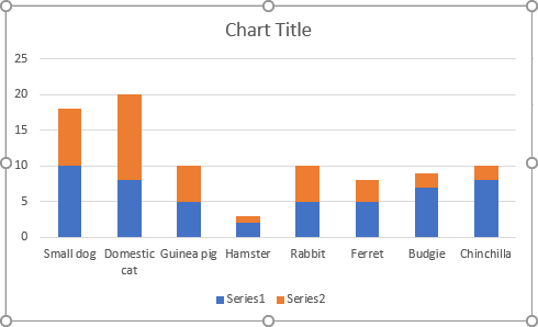
Excel creates the following chart:
3. Format the data series:
The first data series:
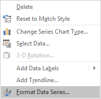
3.1. Right-click on the first data series (Lifespan Min) and choose Format Data Series... in the popup menu:
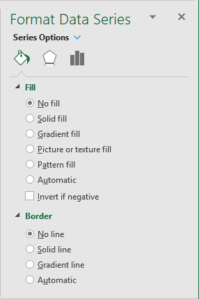
3.2. On the Format Data Series pane:
- On the Fill & Line tab:
- In the Fill section, choose the No fill option,
- In the Border section, choose the No line option:
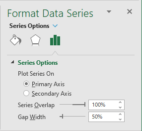
- On the Series Options tab, in the Gap Width field, choose the value you like.
For example, 50%:
The second data series:
3.3. Right-click on the second data series (Difference) and choose Format Data Series... in the popup menu.
3.4. On the Format Axis pane, on the Fill & Line tab, in the Fill group, select the color you prefer.
4. Add the data labels (optional step):
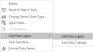
4.1. Right-click on the middle part of the bone data series and choose Add Data Labels -> Add Data Labels in the popup menu:
4.2. Do one of the following:
- Right-click on the data label and select Format Data Label... in the popup menu:
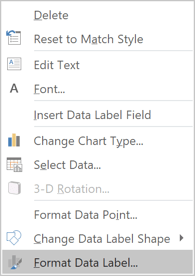
- Right-click on the data point and select Format Data Label... in the popup menu:
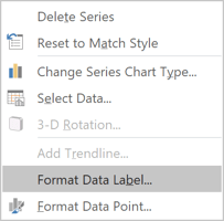
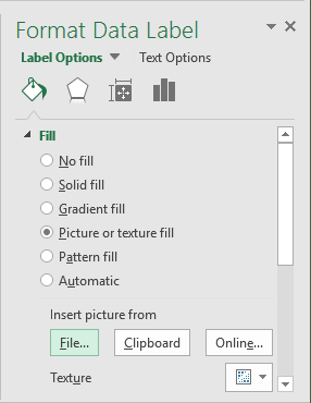
4.3. On the Format Data Label task pane, on the Fill & Line tab, in the Fill group, check Picture or texture fill and then click on the File... button (if you have the picture already), Clipboard or Online... (if you would like to upload picture from Internet):
4.4. Repeat the previous step for all other data labels and insert the appropriate pictures.
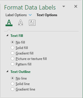
4.5. To hide the data label text, on the Format Data Labels pane, under Text Options, in the Text Fill & Outline tab:
- In the Text Fill group, select No fill,
- In the Text Outline group, select No line:
Remove the vertical axis, the legend, and make any other adjustments you want.
