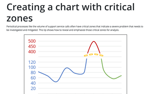
Creating a chart with critical zones
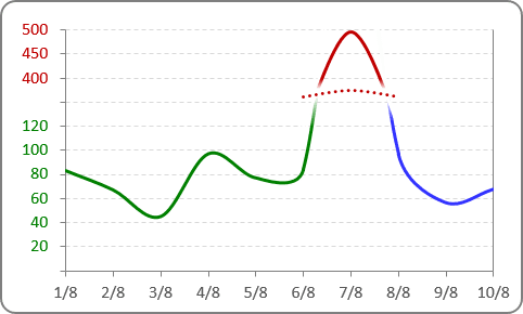
E.g., if you have data like this:
To create the chart with broken data, do the following:
1. Add additional data for this chart - in this example:
- column E to show data before broken line
- column F to show data after broken data
- column G to show the biggest data
- column H for the broken line.
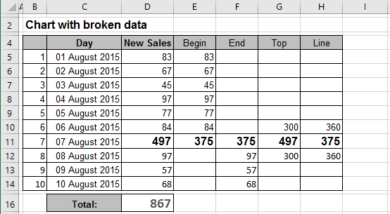
2. Select all necessary data - in this example, C5:C14, E5:H14.
3. On the Insert tab, in the Charts group, select launch or click on the Recommended Charts button:

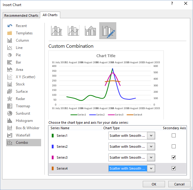
4. In the Insert Chart dialog box, on the All Charts tab, select the Combo group and then choose Custom Combination:
- For all series, choose Scatter with Smooth Line chart type
- For Series3 and Series4, check Secondary Axis:
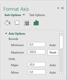
5. Double-click in the primary vertical axis, and then in the Format Axis task pane, make all changes you prefer for this series. For this example:
6. Double-click in the secondary vertical axis, and then in the Format Axis task pane, make all changes you prefer for this series. For this example:

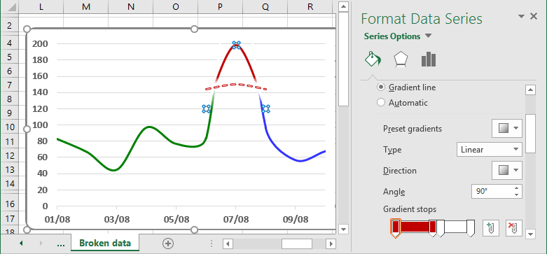
7. To hide parts of the lines, select the part of the line, and choose Gradient Fill for it:
8. Make adjustments for Vertical Axes; do one of the following:
- To show both Axes, hide non-used data - see more how to hide points on the
chart axis:
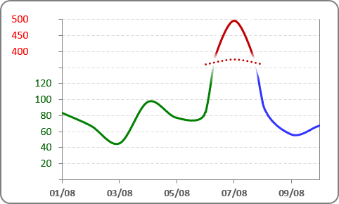
- To hide values of both Axes, on the Format Axis task pane, on the Axis Options tab, in
the Labels group, for Label Position choose None for every axis:
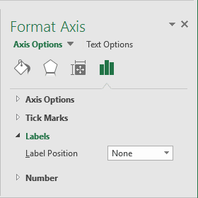
Instead of hidden values, you can add a text box to the data you want.
Make any other adjustments to get the look you desire.
See also this tip in French: Comment démontrer les zones critiques du graphique.
