Creating a Gantt chart
Although Excel doesn't support Gantt charts per se, creating a simple Gantt chart is fairly easy. The key is getting your data set up properly:
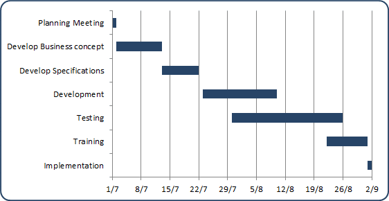
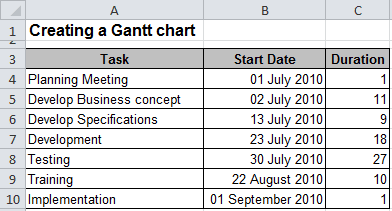
For example, the above Gantt chart is set up to depict a schedule for the project, in range A4:C10.
The horizontal axis represents the total time span of the project, and each bar represents a project task. The viewer can quickly see the duration of each task and identify overlapping tasks.
Column A contains the task name, column B contains the corresponding start date, and column C contains the duration of the task, in days.
Follow these steps to create the Gantt chart:
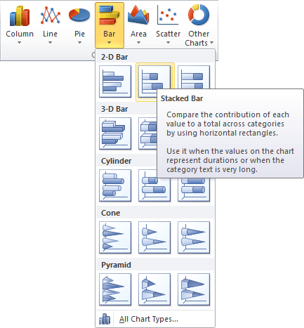
1. Select the range A4:C10 and then on the Insert tab, in the Charts group, select the Bar button and choose Stacked Bar to create a chart:
2. Remove the Legend and do one of the following:
- On the Design tab, in the Data group, choose Select Data:

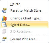
- Right-click in the chart area and choose Select Data... in the popup menu:
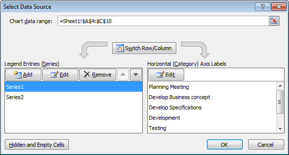
In the Select Data Source dialog box:
- Correct data in Horizontal (Category) Axis Labels. Notice that Excel incorrectly uses the first two columns as the Horizontal (Category) Axis Labels.
- In the Legend Entries (Series) group, add a new data series. Then set the chart's series to
the following:
- Series 1: $B$4:$B$10
- Series 2: $C$4:$C$10
- Horizontal (Category) Axis Labels: $A$4:$A$10
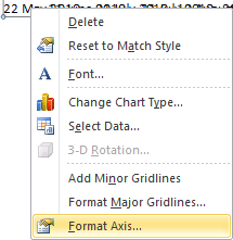
3. Right-click one of the dates along the category axis and select Format Axis... in the popup menu:
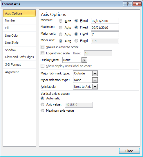
In the Format Axis dialog box, adjust the horizontal axis Minimum and Maximum scale values to correspond to the earliest and latest dates in the data. You also may want to set the Major unit to 7 to indicate weeks:
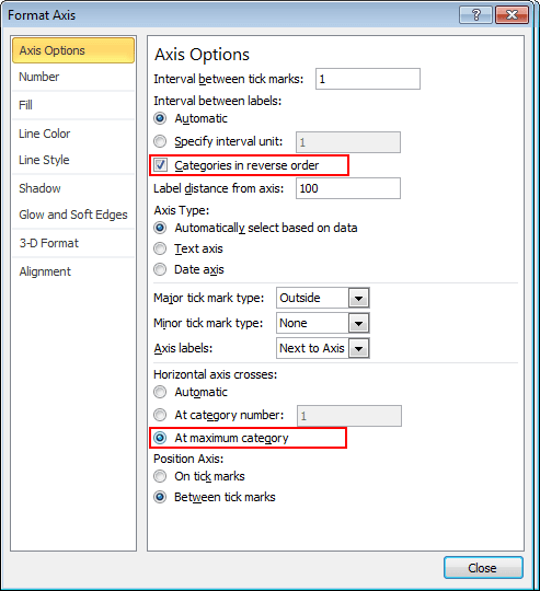
4. Access the Format Axis dialog box for the vertical axis: in the Axis Options tab, check the option labeled Categories in reverse order, and also set the option labeled At maximum category in the Horizontal axis crosses group:
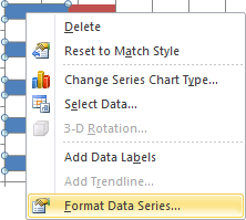
5. Right-click in the first data series and choose Format Data Series... in the popup menu:
To makes the first data series invisible, in the Format Data Series dialog box:
- On the Fill tab, set Fill to No fill
- On the Border Color tab, set Border Color to No line
6. Apply other formatting as desired.
