How to create a histogram chart by category using frequencies in Excel
- For the histogram with By category option for bins, Excel calculates the data bin height as SUM of data points within the bin range,
- For the histogram with any other option for bins, Excel calculates the data bin height as COUNT of data points within the bin range.
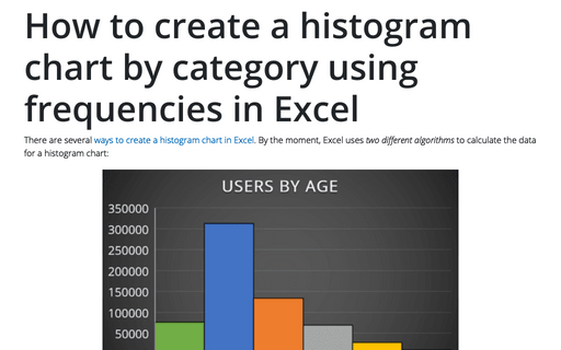
Thus, for web analysis or any other reporting, when it is necessary to consolidate several disparate reports with pre-calculated frequencies and bins, becomes useful a histogram chart by categories:
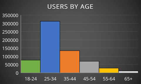
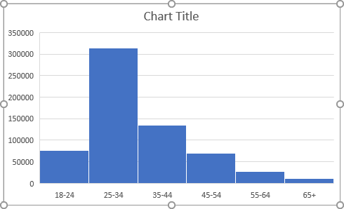
In this example, the histogram chart shows the distribution of ages of users on our Web site for some period of time.
To create a histogram chart using partially calculated frequencies in Excel for Microsoft 365, do the following:
1. Prepare the data for the chart.
For example, the summary table with calculated data for different countries using additional filters looks like:
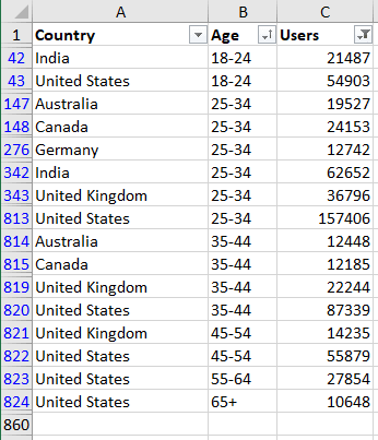
Note: To display the intervals on the horizontal axis in the correct order, the charts need the data to be sorted. See Using a custom sort order for more details.
2. Create a histogram chart:
2.1. Select the prepared data (in this example, B1:C859 or all columns B:C).
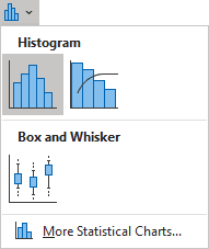
2.2. On the Insert tab, in the Charts group, click on the Insert Statistic Chart button:

From the Insert Statistic Chart dropdown list, select Histogram:
The labels for the x-axis are invalid so far:
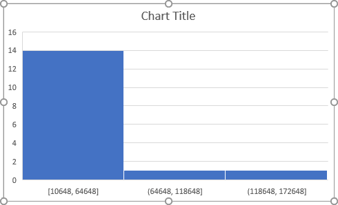
3. Format the histogram chart:
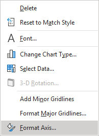
3.1. Right-click on the horizontal axis and choose Format Axis... in the popup menu:
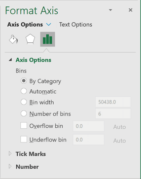
3.2. On the Format Axis pane, on the Axis Options tab, under Bins, select the By Category option:
Excel changes the histogram chart:
Make any other adjustment you desire.
