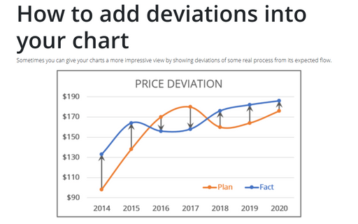
How to add deviations into your chart
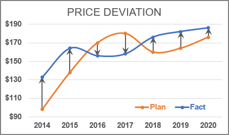
To create a chart with deviations, do the following:
1. Select the data range (in this example, B2:D9):
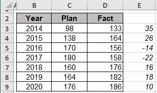
Note: Cells E3:E9 contains the formula Fact - Plan.
2. On the Insert tab, in the Charts group, choose the Insert Line or Area Chart button:

Choose Line:
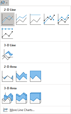
3. Do one of the following:
- On the Chart Design tab, in the Data group, choose Select Data:

- Right-click in the chart area and choose Select Data... in the popup menu:
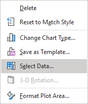
4. In the Select Data Source dialog box, select data for series and for horizontal (category) axis:
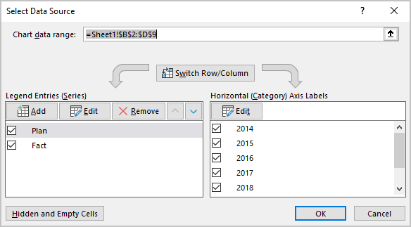
5. Select the data series to which you want to add deviations, then do one of the following:
- Click on the Chart Elements button, select the Error Bars list, then choose More Options...:
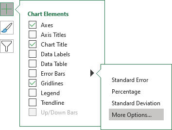
- On the Chart Design tab, in the Chart Layouts group, click the Add Chart Element drop-down list:

In the Add Chart Element drop-down list, choose the Error Bars list, then click More Error Bars Options...:
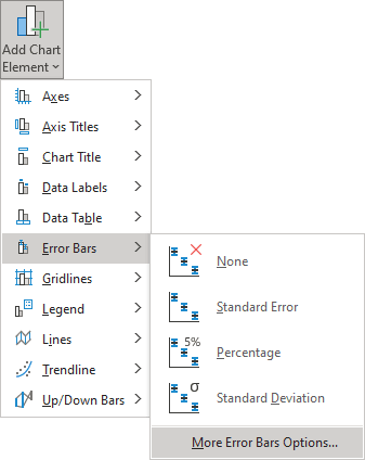
6. On the Format Error Bars pane:
- On the Error Bars Options tab, in the Vertical Error Bar section, choose:
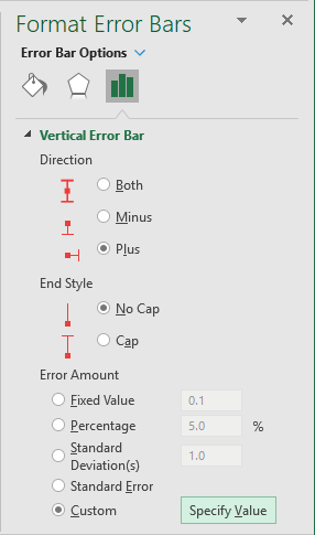
- In the Direction group, choose the Plus option - to show the actual data point value plus a specific error amount.
- In the End Style group, choose the No Cap option - to display error bars without end caps.
- In the Error Amount group, the Custom option, and then click the Specify Value to use values in a spreadsheet range that you specify as deviations (in this example E3:E9):
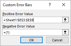
- On the Fill & Line tab, in the Line section:
- Change the Width of the line,
- Select arrow settings:
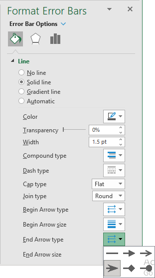
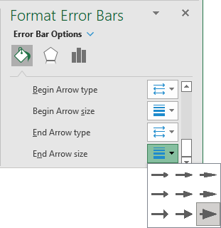
You can then make any other adjustments to get the look you desire.
See also this tip in French: Comment ajoutez des écarts dans votre graphique.
