How to add elbow to the table
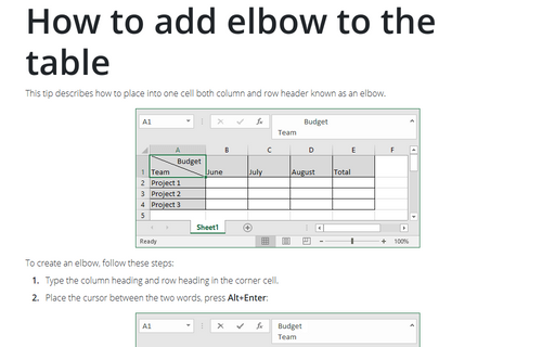
This tip describes how to place into one cell both column and row header known as an elbow.
Creating a semaphore thermometer chart
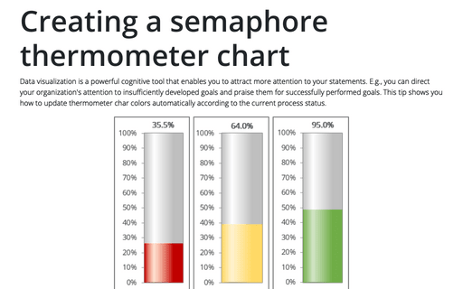
Data visualization is a powerful cognitive tool that enables you to attract more attention to your statements. E.g., you can direct your organization's attention to insufficiently developed goals and praise them for successfully performed goals. This tip shows you how to update thermometer char colors automatically according to the current process status.
How many work weeks left to or passed from the specific date in Excel
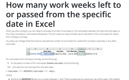
When you plan a project, you can need to calculate a number of workdays or full workweeks between the start and end dates, or how many workdays or workweeks left/passed. This tip is about an easy and fast way of calculation of full workweeks for weeks from Monday to Sunday.
Calculating the number of days between two dates
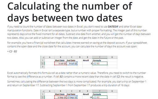
If you need to count the number of dates between two dates in Excel, you don't need to use
DATEDIF and other Excel date manipulation functions. Date in Excel isn't a separate
type, but a number with proper formatting. The integer part of this number represents days
since the fixed moment for all dates. Subtract one date from another, and you will get the
number of days between two dates. Also, you can add or subtract an integer from the date,
and get the date in the future or the past.
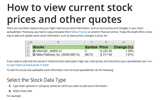
How to view current stock prices and other quotes in Excel
There are countless reasons why you might need actual stock information, such as stock prices and changes, in your Excel spreadsheet. Previously, you had to copy and paste from Yahoo Finance or another financial service.
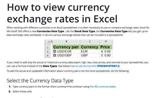
How to view currency exchange rates in Excel
When working with different currencies in an Excel spreadsheet, it is often necessary to use or compare exchange rates. Excel for Microsoft 365 offers a new Currencies Data Type. Like the Stock Data Type, the Currencies Data Type lets you get up-to-date exchange rates worldwide. It returns various exchange details that can be included in a spreadsheet.
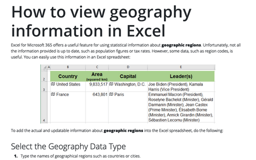
How to view geography information in Excel
Excel for Microsoft 365 offers a useful feature for using statistical information about geographic regions. Unfortunately, not all the information provided is up to date, such as population figures or tax rates. However, some data, such as region codes, is useful. You can easily use this information in an Excel spreadsheet:
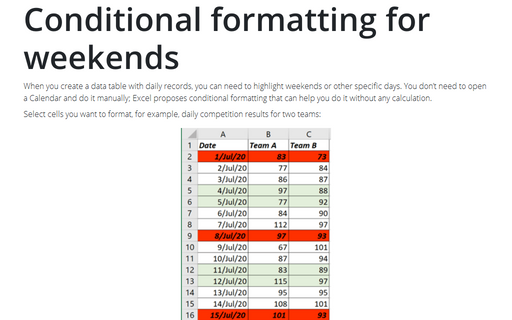
Conditional formatting for weekends
When you create a data table with daily records, you can need to highlight weekends or other
specific days. You don’t need to open a Calendar and do it manually; Excel proposes conditional
formatting that can help you do it without any calculation.
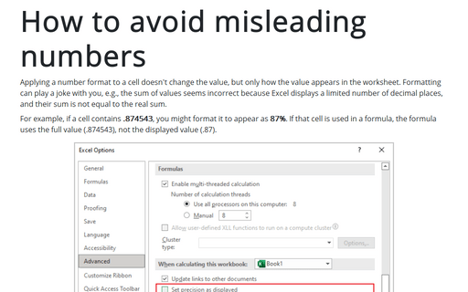
How to avoid misleading numbers
Applying a number format to a cell doesn't change the value but only how the value appears in the worksheet. Formatting can play a joke with you, e.g., the sum of values seems incorrect because Excel displays a limited number of decimal places, and their sum is not equal to the real sum.
