How to create a histogram chart by categories in Excel
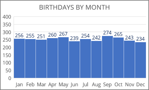
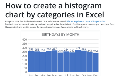
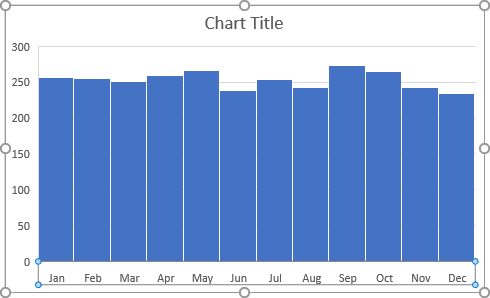
In this example, the histogram chart shows the distribution of birthdays by month for the more than 3000 employees of a company. Months are just one example of ordered categorical data. Others are categories of size (small, medium, large), weight (light, normal, heavy), etc.
To create a histogram chart of non-numeric data in Excel for Microsoft 365, do the following:
1. Prepare the data for the chart:
1.1. Add the new data for the chart:
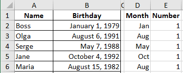
where:
- Column Month repeats the data from the column Birthday and has the format "mmm" to show just a month name:
= TEXT (<birthday>, "mmm")
- Column Number has the number 1 (one person has this date of birthday).
1.2. Sort the additional data for the chart:
Note: This step is optional. It is needed to see the months in the chart in sorted order. Skip this step if you have non-numeric categories that do not require sorting.
To sort the data derived from the other data, you can:
- Select and sort all the data, including the cells from which the formula calculates,
- Select only additional data, copy it to the Clipboard (by clicking Ctrl+C), and then paste it using the Paste Special options, see Paste results into cells without formulas.
1.2.1. Select the data (in this example, D2:D3041 or select the column).
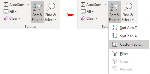
1.2.2. On the Home tab, in the Editing group, click the Sort & Filter button and then select Custom Sort...:
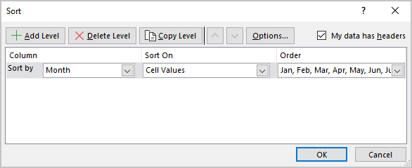
1.2.3. In the Sort dialog box:
- In the Sort by list, choose the column for sorting,
- In the Order list, choose the sorting method (see Using a custom sort order),
- Make sure that the option My data has headers is selected, if you selected the columns with respective headers:
2. Create a histogram chart:
2.1. Select the prepared data (in this example, D2:E3041).
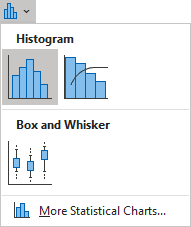
2.2. On the Insert tab, in the Charts group, click on the Insert Statistic Chart button:

From the Insert Statistic Chart dropdown list, select Histogram:
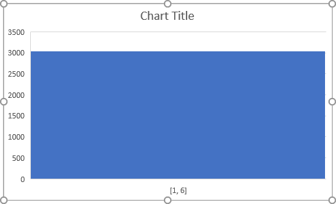
Excel creates the incomprehensible histogram chart from the data:
3. Format the histogram chart axes:
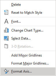
3.1. Right-click on the horizontal axis and choose Format Axis... in the popup menu:
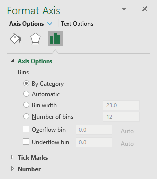
3.2. On the Format Axis pane, on the Axis Options tab, under Bins, select the By Category option:
Excel changes the histogram chart:
Make any other adjustments you find appropriate.
