How to create different types of histogram charts in Excel
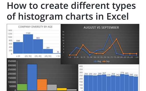
A histogram chart visualizes the distribution of continuous data. Each column in the histogram chart represents the frequency (amount) of the data within the specific range.
How to create one chat of split bars or small multiple bars in Excel
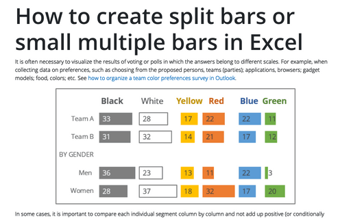
It is often necessary to visualize the results of voting or polls in which the answers belong to different scales. For example, when collecting data on preferences, such as choosing from the proposed persons, teams (parties); applications, browsers; gadget models; food, colors; etc. See how to organize a team color preferences survey in Outlook.
How to make Mirror chart in Excel
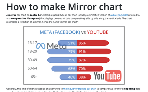
A mirror bar chart or double bar chart is a special type of bar chart (actually, a simplified version of a diverging chart referred to as a comparative histogram) that displays two sets of data comparatively side by side along the vertical axis. The chart resembles a reflection of a mirror, hence the name "mirror bar chart":
Using two axes in one chart
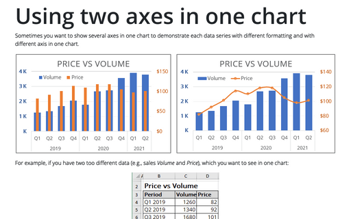
Sometimes you want to show several axes in one chart to demonstrate each data series with different
formatting and with different axis in one chart.
How to create simple diverging bar chart
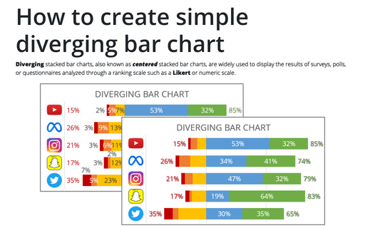
Diverging stacked bar charts, also known as centered stacked bar charts, are widely used to display the results of surveys, polls, or questionnaires analyzed through a ranking scale such as a Likert or numeric scale.
How to add a vertical line to the line or bar chart
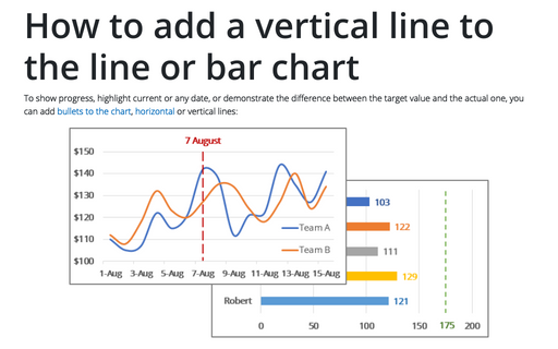
To show progress, highlight current or any date, or demonstrate the difference between the target value and the actual one, you can add bullets to the chart, horizontal or vertical lines:
Tally chart in Excel
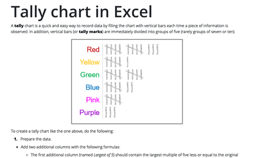
A tally chart is a quick and easy way to record data by filling the chart with vertical bars each time a piece of information is observed. In addition, vertical bars (or tally marks) are immediately divided into groups of five (rarely groups of seven or ten).
How to create bar chart of the survey results
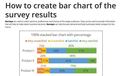
Surveys are used to collect opinions, preferences, and choices of the target audiences. They can be used to provide information that will help to make better business decisions. Surveys can help forecast demand and help businesses better prepare for the future.
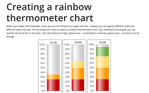
Creating a rainbow thermometer chart
When you create a thermometer chart, you are not limited to a single color bar. Instead, you can specify different colors for different value intervals. This tip shows you how to create a rainbow thermometer chart. E.g., working on some goal, you can specify risk zones for it: red zone - the risk of failure is high, yellow zone - success/fail is unknown, green zone - success is not far enough.
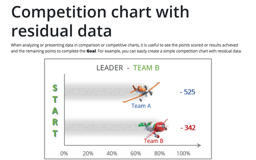
Competition chart with residual data
When analyzing or presenting data in comparison or competitive charts, it is useful to see the points scored or results achieved and the remaining points to complete the Goal. For example, you can easily create a simple competition chart with residual data:
