Funny and amusing charts for your next presentation
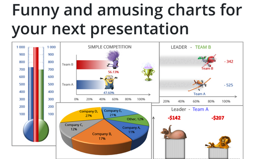
Several different Excel features can make your presentation less boring:
How to create Master and Scrolled Detail charts
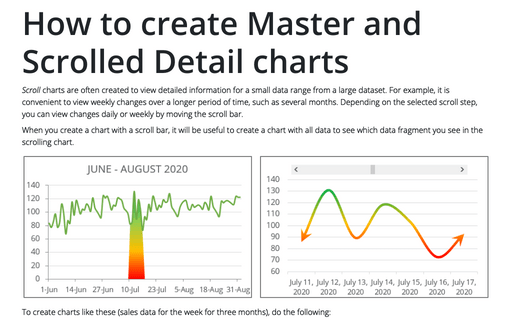
Scroll charts are often created to view detailed information for a small data range from a large dataset. For example, it is convenient to view weekly changes over a longer period of time, such as several months. Depending on the selected scroll step, you can view changes daily or weekly by moving the scroll bar.
How to add a vertical line to the scatter chart
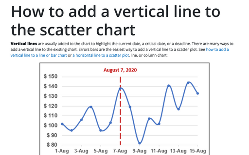
Vertical lines are usually added to the chart to highlight the current date, a critical date, or a deadline. There are many ways to add a vertical line to the existing chart. Errors bars are the easiest way to add a vertical line to a scatter plot. See how to add a vertical line to a line or bar chart or a horizontal line to a scatter plot, line, or column chart:
Customize the horizontal axis labels
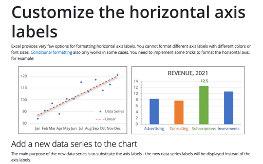
Excel provides very few options for formatting horizontal axis labels. You cannot format different axis labels with different colors or font sizes. Conditional formatting also only works in some cases. You need to implement some tricks to format the horizontal axis, for example:
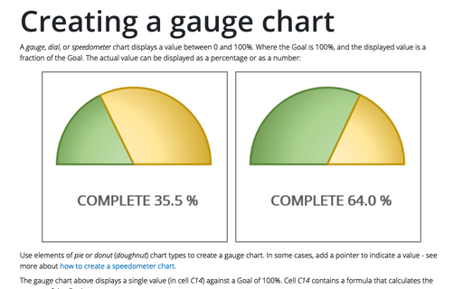
Creating a gauge chart
A gauge, dial, or speedometer chart displays a value between 0 and 100%. Where the Goal is 100%, and the displayed value is a fraction of the Goal. The actual value can be displayed as a percentage or as a number:
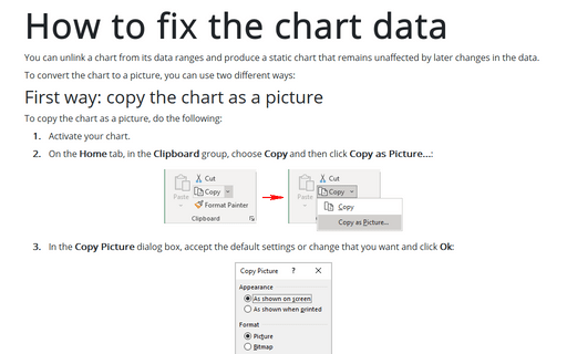
How to fix the chart data
You can unlink a chart from its data ranges and produce a static chart that remains unaffected by later changes in the data.
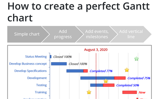
How to create a perfect Gantt chart
Gantt charts illustrate project schedules and, thus, often used by project managers. Project management tools like Microsoft Project are better suited for Gantt charts, but it is easy to create a Gantt chart in Excel following the simple steps.
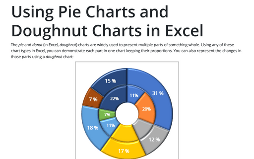
Using Pie Charts and Doughnut Charts in Excel
The pie and donut (in Excel, doughnut) charts are widely used to present multiple parts of something whole. Using any of these chart types in Excel, you can demonstrate each part in one chart keeping their proportions. You can also represent the changes in those parts using a doughnut chart:
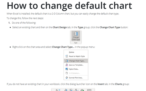
How to change default chart
When Excel is installed, the default chart is a 2-D Column chart, but you can easily change the default chart type.
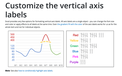
Customize the vertical axis labels
Excel provides very few options for formatting vertical axis labels. All axis labels are a single object - you can change the font size and color or apply effects to all labels at the same time. Even the gradient fill with the color of the axis labels works for us as for the whole item and not for individual objects.
